
Aurora UI Design System Project
Overview
The Design System was developed to create a consistent, scalable, and cohesive visual language across various digital products. This system serves as a single source of truth for the visual and interactive elements, ensuring that the interface is clean, accessible, and easily maintainable. The system includes typography, spacing, color palettes, gradients, icons, and more, providing designers and developers with a set of reusable components to work from.
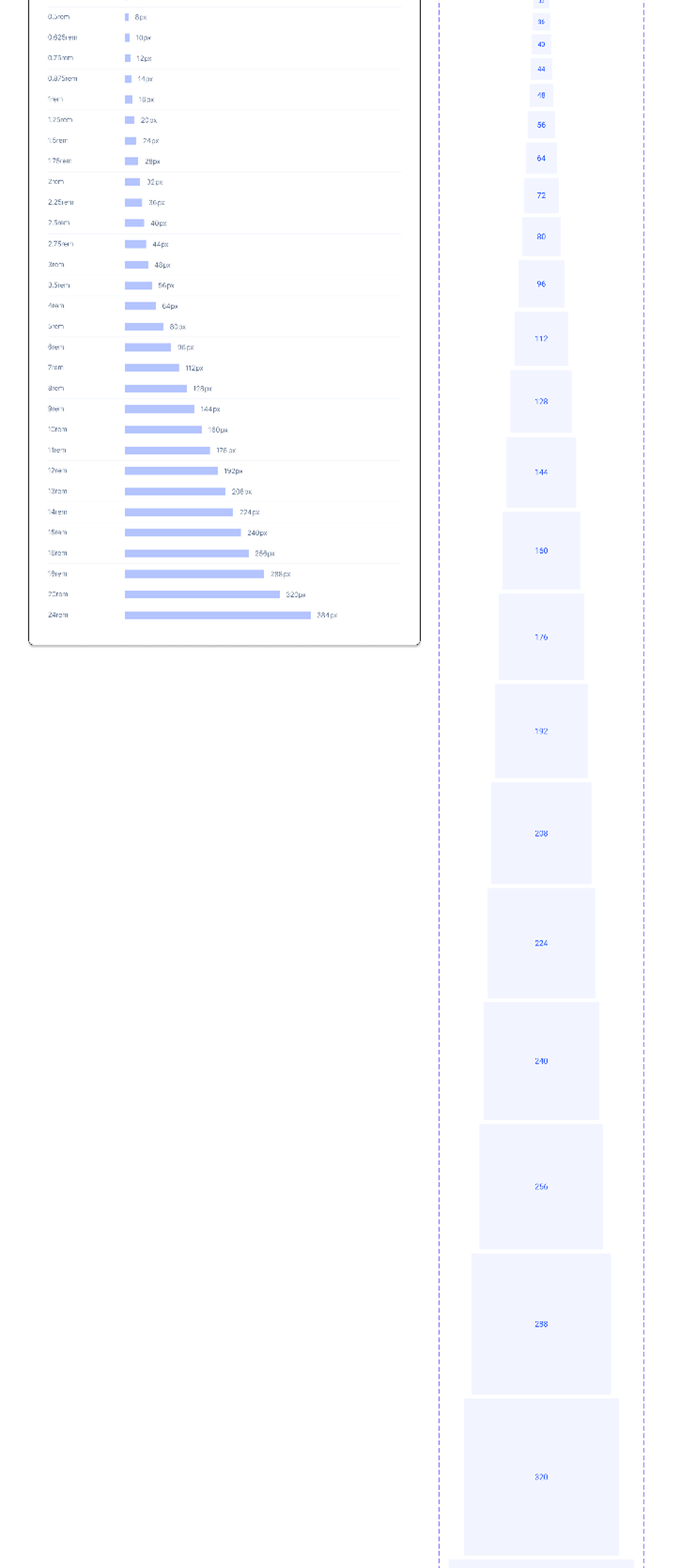
Spacing Guidelines
Spacing is essential in creating a balanced and visually organized interface. By standardizing the spacing system, we ensure consistency in layout across all UI elements.
- System: The design system uses a rem-based scale to maintain proportional spacing across devices. This scale ensures that components, margins, and padding are flexible yet consistent, supporting responsive design.
- Key Details: The linear progression of the spacing system makes it intuitive for both designers and developers to apply uniform spacing, ensuring that components align perfectly.
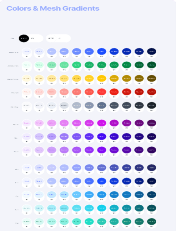
Color Palette & Mesh Gradients
Colors help define the brand identity and improve user interaction by providing clear visual cues. The color system ensures sufficient contrast for accessibility while maintaining a cohesive visual tone across the platform.
-
Color Palette: The palette includes base colors (black, white, grey) and a range of primary, secondary, and accent colors. Each color has a range of tints and shades for flexibility, allowing for diverse use across different elements like buttons, backgrounds, and text.
Example: The base color set includes black and white as the foundation, while the primary colors are designed to stand out against light and dark backgrounds. Accent colors are applied to interactive elements like buttons and icons. - Mesh Gradients: The gradients, ranging from two-color to four-color combinations, add visual depth to backgrounds, cards, and large components. These gradients enhance the modern aesthetic of the platform and are used sparingly to highlight key sections of the interface.
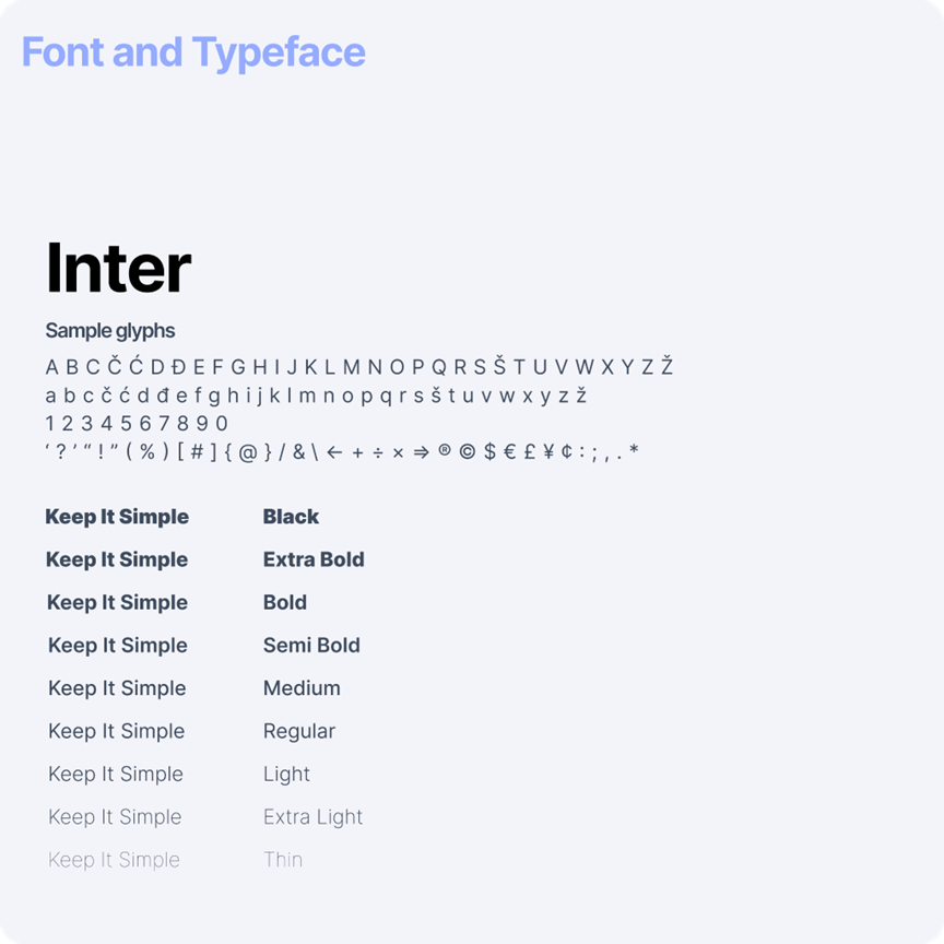
Typography
Typography is the backbone of any design system, ensuring readability, consistency, and hierarchy across the platform. This system employs the Inter typeface for both headlines and body text, chosen for its clean and modern design.
- Font Weights: The typography system includes multiple weights, from thin to bold, providing flexibility in creating contrast and emphasis throughout the interface. These variations are applied across headings, subheadings, body text, and labels.
- Typographic Scale: The type scale follows a responsive pattern, ensuring that text adjusts smoothly between devices while maintaining readability. The scale includes display fonts for large headlines and body text for content-heavy sections.
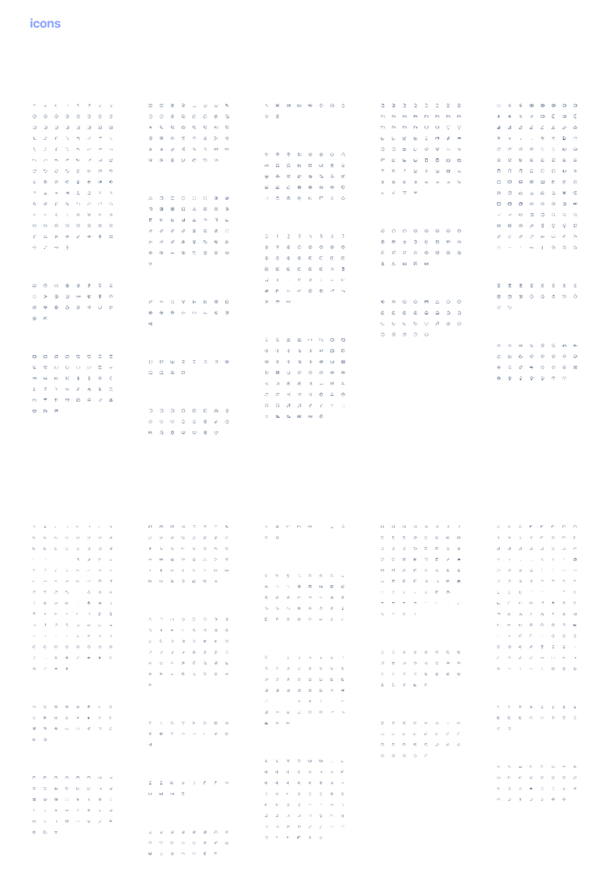
Iconography
Icons play a critical role in enhancing the usability and navigation of the platform. They offer users a visual shorthand for interacting with content, ensuring that key actions and information are easily identifiable.
- Design: The icon set is minimalist, following a line-based style that aligns with the modern aesthetic of the rest of the design system. The icons are scalable, ensuring they maintain clarity at various sizes.
- Use Cases: Icons are used throughout the system to represent actions (e.g., edit, delete, save), status indicators (e.g., loading, completed), and navigation elements. They are designed to be simple and unobtrusive, enhancing the visual hierarchy without overwhelming the user.
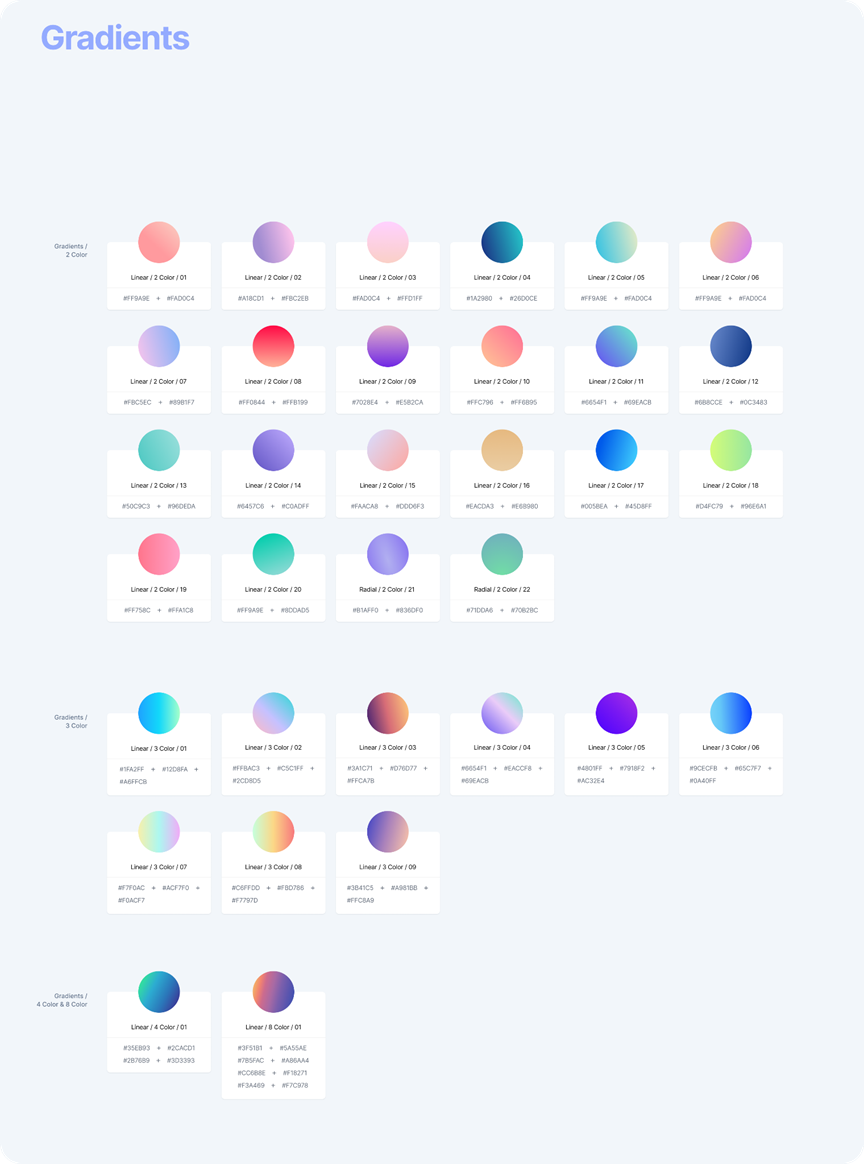
Gradients
Gradients are strategically used to enhance depth and dimension in the user interface without overwhelming the content. By applying gradients to backgrounds, cards, and buttons, the design draws attention to interactive elements and key sections, guiding users naturally through the interface. This subtle use of gradients helps maintain a clean, modern look while providing visual emphasis where needed.
The design system incorporates both linear and radial gradients to offer versatility. Linear gradients, available in two, three, and four-color combinations, allow for smooth transitions and a polished aesthetic. Radial gradients provide additional flexibility, enabling designers to create dynamic focal points across various UI components, ensuring consistency and visual appeal throughout the platform.
Conclusion
The keep Design System provides a unified framework for designers and developers to maintain consistency across digital products. By adhering to these guidelines, the system ensures a cohesive visual experience, seamless scalability, and ease of use, all while maintaining a modern and clean aesthetic.