
Cobalt Financial Management Dashboard Landing Page

Project Overview
The project aimed to develop a financial management tool that consolidates data, provides mobile access, and integrates with external apps, balancing functionality with a modern, user-friendly interface for efficient navigation of complex financial information.
Project Name
Cobalt Financial Management Dashboard
Role
UI/UX Designer
Tools Used
Figma, Sketch
Duration
3 weeks
Design Process
Reasearch and Analysis
I conducted user interviews and surveys to thoroughly understand the pain points users face when managing multiple financial tools. Through these insights, it became clear that users struggled with juggling various platforms and desired a more streamlined experience. Additionally, a detailed competitor analysis revealed the growing need for an integrated, mobile-first solution that not only simplifies financial management but also offers users greater control over notifications and seamless connectivity with third-party applications, enhancing their overall experience.
Design Goals
The goal was to provide users with a clean, intuitive interface for managing their finances and external applications. Ensuring seamless interaction across both desktop and mobile platforms was a key priority, allowing users to easily access features regardless of the device they were using. Additionally, localization was prioritized to accommodate a diverse user base, with specific attention given to supporting Arabic-speaking users for a more inclusive experience.
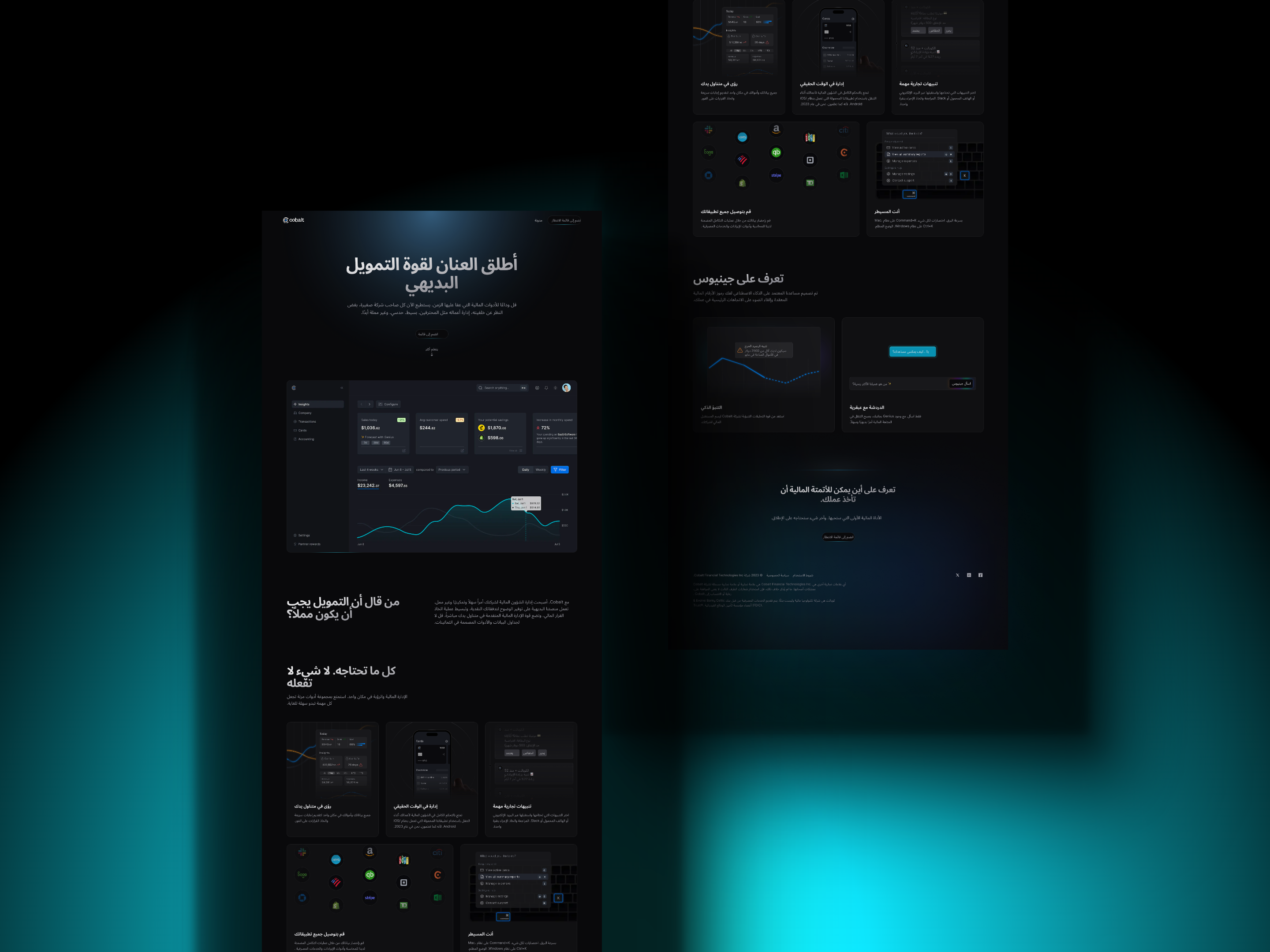
Header Section:
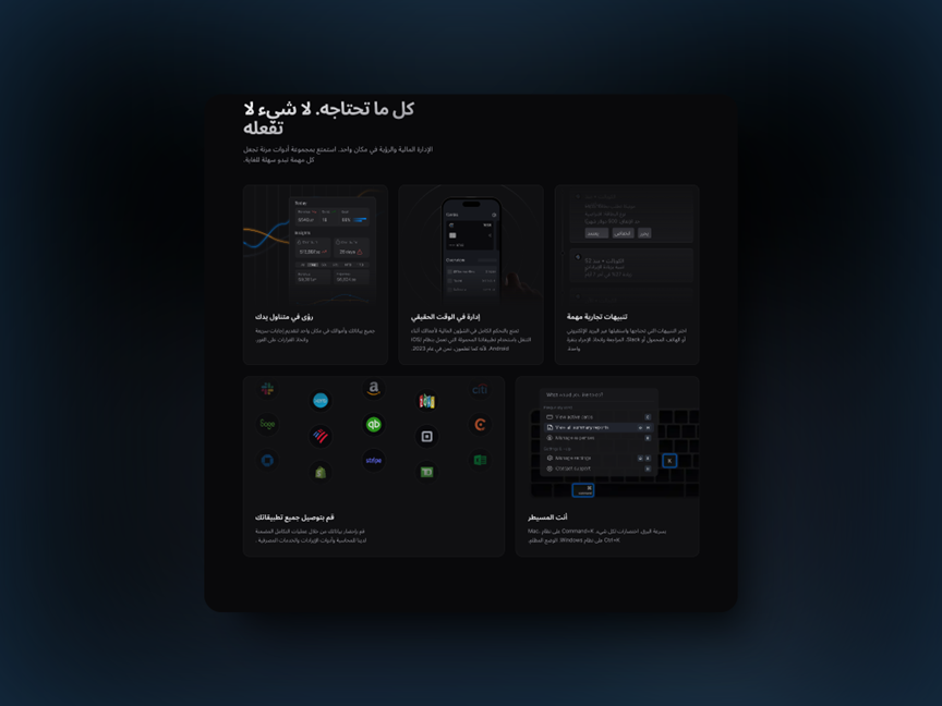
- The main message, "Everything you need, nothing you don’t," captures the essence of simplicity and efficiency, reinforcing a minimalistic approach.
- The decision to use a dark theme creates a modern look and ensures users can focus on the content with minimal eye strain, especially in low-light environments
Insights & Financial Data Visualization
- In the first section, graphs and financial data are presented in a clear and structured layout, allowing users to easily access their balance, expenses, and revenues.
- The decision to highlight critical financial insights visually helps users quickly understand their financial health without needing to dive into details.
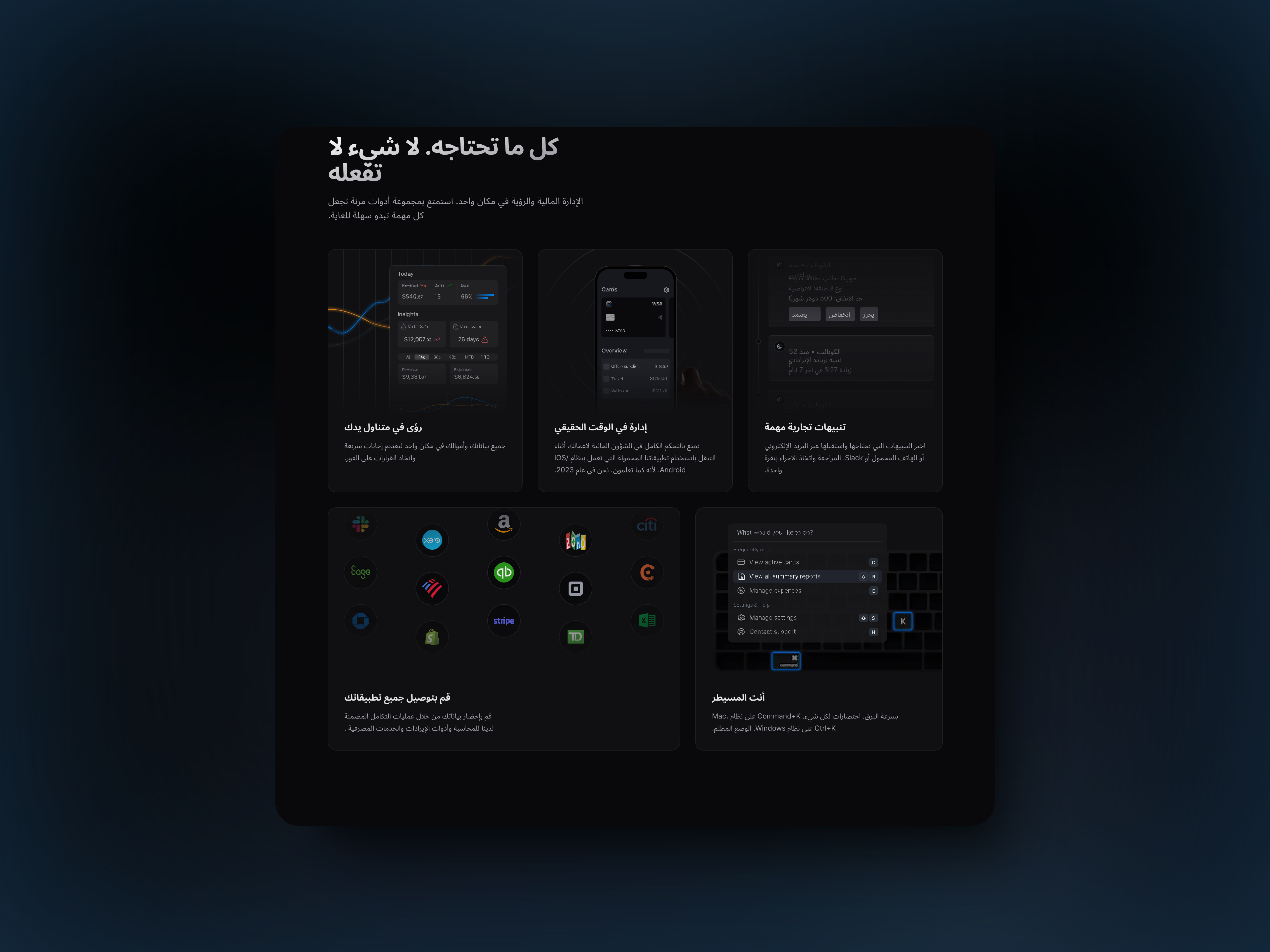
Mobile Control & Accessibility
- The mobile interface emphasizes that the app is fully optimized for cross-platform usage. The ability to manage finances on the go, with synchronized data across devices, was a core design decision. This ensures consistency and flexibility, which is essential for modern, on-the-move users.
Notification Settings
- Customizable alerts were a critical feature, allowing users to tailor notifications for different financial events. The clean design of this section ensures that users can quickly adjust preferences without feeling overwhelmed.
Application Integrations
- The project integrates with several third-party tools like accounting software, payment processors, and banking apps. The decision to use recognizable icons in this section makes it easier for users to connect familiar services. The UI accommodates these integrations visually, showing users they can streamline their financial workflows.
Shortcut Controls for Power Users
- A dedicated section for keyboard shortcuts offers enhanced control for desktop users, improving overall efficiency. This feature empowers users who prefer to navigate quickly, providing them with key combinations to speed up their tasks.
UI Design Breakdown
Design Decisions
- Dark Theme: A dark UI not only feels modern but also enhances readability and reduces eye strain during extended periods of use, especially for a financial tool.
- Modular Layout: Each feature is presented in its own section, allowing users to find what they need without clutter. This enhances usability and navigation, especially in a dashboard that handles complex data.
- Iconography & Visual Hierarchy: Icons play a major role in user recognition, particularly in the app integration section. The visual hierarchy, supported by bold typography and ample whitespace, ensures that users’ attention is drawn to the most important elements first.
- Localization: Arabic text supports regional users, offering a fully localized experience that resonates with the target audience. By catering to this market, the project ensures broader accessibility.
Content
A central header with a clear, compelling statement:
“ Everything you need, nothing you don’t ”
Three primary sections below the header:
- Financial Data & Insights: A visualization of data to help users understand their financial situation, with trends and summaries.
- Customization & Alerts: Users can manage notifications to stay informed about critical financial activities.
- Mobile Accessibility: A preview of how the financial data is accessible via mobile apps, emphasizing control from any device.
Application Integration: A section showing the logos of different apps (such as Sage, Zoho, Amazon, etc.), indicating that users can integrate external tools and services for a holistic financial management experience.
User Controls: Includes shortcuts and keyboard combinations for desktop users to increase efficiency.
Design Decisions
-
Dark Theme:
The dark interface creates a modern, sophisticated look, reducing eye strain and making key data visually pop.
-
Visual Hierarchy:
Clear separation of content areas with space between the sections helps users easily navigate and find the information they need.
-
Iconography:
Recognizable app icons and simple, bold visualizations make navigation intuitive and user-friendly.
-
Consistency:
The consistent use of typography, icon style, and color across sections enhances usability and keeps the interface clean.
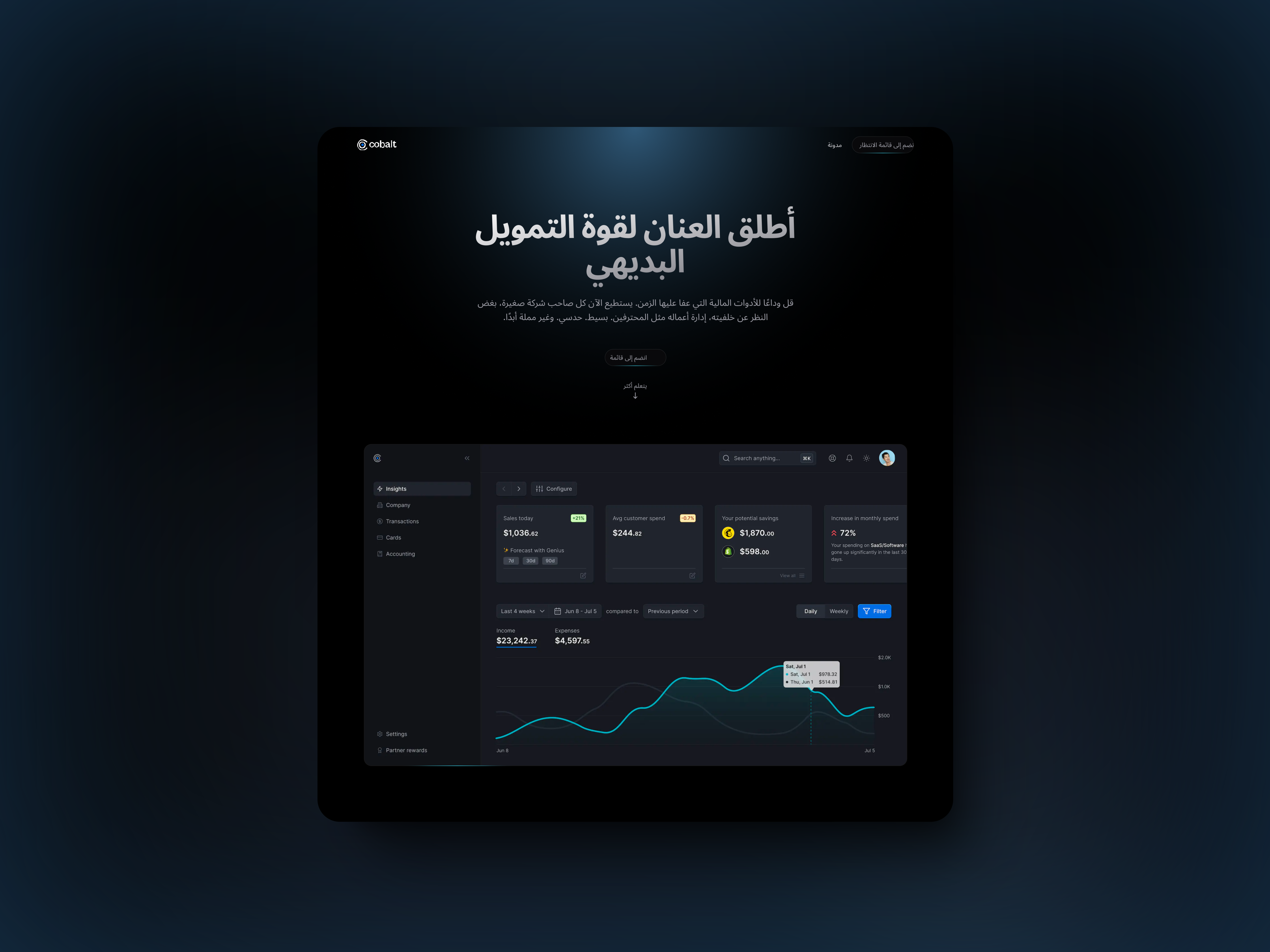
Insights & Data Analysis Page
Content
A header emphasizing simplicity and clarity in financial management:
" Unleash the power of intuitive finance "
A dashboard with detailed financial data visualizations and widgets, including sections for:
- Sales Today: Shows today’s sales data.
- Expenses: Tracks both predicted and actual spending.
- Potential Savings: Highlights where the user can save.
- Trends: Offers insights into monthly spending trends.
Filters for adjusting the data displayed (e.g., daily, weekly).
Design Decisions
-
Minimalistic Header:
The top header keeps the message clear and concise, focusing on user empowerment through data.
-
Data Visualization:
Line charts and graphs make it easier for users to interpret financial trends and performance.
-
Interactive Elements:
Filters for changing data views (e.g., by day or week) encourage user interaction and exploration of the dashboard’s features.
-
Information-readability balance:
By keeping the widgets separated and clearly labeled, the design ensures that users won’t be overwhelmed by the amount of information presented.
Conclusion
The final design offers a sleek, user-friendly experience for managing finances, accessible across devices. By focusing on clean layouts, modular sections, and ease of integration, the project balances complex functionality with a user-centric approach. The dark theme, mobile accessibility, and localization were key decisions that enhanced the usability and overall experience for users.