
Heritage House Future Residence Website
Project Overview
The goal of this project was to design an engaging, visually appealing website for a luxury real estate company. The platform needed to highlight premium residential properties while offering a seamless user experience for potential buyers. The challenge was to balance high-quality visuals with functionality, allowing users to explore properties, review project details, and easily contact the company.
Project Name
Heritage House Future Residence Website
Role
UI/UX Designer
Tools Used
Figma, Sketch
Duration
2 weeks
Design Process
Research & Analysis
Conducted user surveys to understand key expectations for online real estate platforms, focusing on visual appeal, ease of navigation, and quick access to property details.
Competitor analysis showed that many luxury real estate websites lacked user-friendly layouts, leading to a cluttered experience. This highlighted the need for a sleek, clean interface.
Design Goals
Provide users with a visually stunning, easy-to-navigate website that effectively showcases luxury properties.
Ensure cross-platform consistency with mobile-friendly design, allowing users to explore properties on both desktop and mobile.
Build trust and transparency by prominently displaying project details, testimonials, and contact information.
UI Design Breakdown
Header Section
" We create your future residence "
The main message sets a tone of aspiration, inviting users to explore luxury homes. The use of large typography and a clean, white background against the rich property images ensures that users focus on the message.
The minimalistic navigation bar is designed to make exploration simple, with clear links to key sections like projects, management, and contact options.
Property Showcases & Project Highlights
High-quality images of luxurious buildings and homes are prominently featured in the first section. The layout is structured to showcase the most attractive properties, with each image linked to further project details.
A hover-over effect is used for image interactivity, making users feel engaged while exploring.
User-friendly filtering options ensure users can sort properties by type (e.g., apartment, villa, penthouse) or by location.
Testimonials & Client Trust Section
The middle section includes statements like,
" Satisfaction is the key, "
emphasizing trust and quality service. A combination of testimonials and key project stats (e.g., 8.4M+ happy customers) helps build credibility.
Mobile Control & Cross-Platform Accessibility
The mobile-first design ensures users can explore properties effortlessly, with touch-friendly controls, fluid scrolling, and adaptable content.
Emphasis is placed on seamless communication via mobile devices, with quick access to contact forms and consultation scheduling.
Project Portfolio & Featured Homes
A modular grid layout displays the top luxury properties, giving each property equal visibility while allowing users to easily compare options.
Each project card provides a brief overview, allowing users to quickly understand the core offerings (e.g., location, size, and pricing).
Icons and CTA buttons like "Get Started" are included to encourage quick user action.
Navigation and User Assistance
The lower section is designed to provide quick answers to common user questions (e.g., "Why choose us?" and "What benefits can I get?"). This allows users to address their concerns and take the next step toward buying a home.
Design Decisions
Clean Visual Design
The overall aesthetic reflects a modern, high-end lifestyle, combining luxury property images with white space and minimalistic typography. This ensures that the homes remain the focal point of the page.
Imagery Focus
Full-width images with high resolution were a priority in order to convey the elegance and exclusivity of each property. The imagery appeals to aspirational buyers who are looking for both beauty and function in their homes.
Modern Typography & Dark Elements
Darker elements and backgrounds are used selectively, contrasting with light sections to create a premium feel. Bold fonts and sharp contrasts emphasize key messages.
Responsive Layout
The site is fully responsive, ensuring a smooth user experience across devices. The mobile version mirrors the desktop experience with simplified interactions and touch-friendly buttons.
Iconography & Visual Hierarchy
Icons and visual hierarchy guide users through the different sections, making navigation intuitive. The use of large buttons and clear CTAs ensures that users can easily explore properties or get in touch for more information.
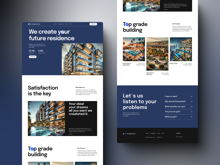
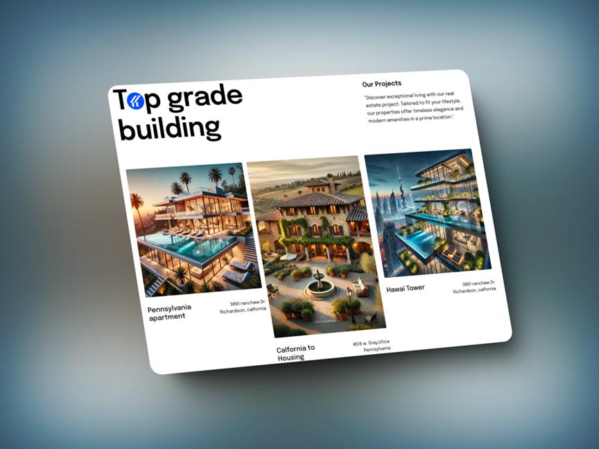
Section 1: Top Grade Building
This section acts as a project showcase, highlighting multiple real estate projects with eye-catching visuals. The layout is simple but effective, with each project displayed as a tile, allowing users to quickly browse through premium real estate offerings.
-
Headline:
The phrase "Top Grade Building" establishes the quality and high standards of the company’s construction projects. The combination of bold typography and a sleek layout draws immediate attention, emphasizing the company's focus on excellence.
-
Visual Layout & Project Display:
Three property cards are presented side-by-side, each featuring a large, high-resolution image of the property. This allows users to visually compare different projects at a glance. Beneath each image, the project’s name and location are clearly labeled, helping users identify properties by name and geographical area.
-
Project Descriptions:
The small text on the right titled "Our Projects" provides a brief overview, explaining that these are premium real estate projects designed to fit the user’s lifestyle, combining elegance and modern amenities. The section balances text and imagery, with the visuals playing a dominant role, reinforcing the luxury aspect of the brand.
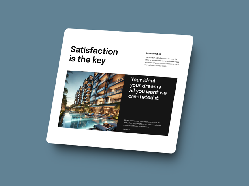
Section 1: Top Grade Building
This section focuses on building trust and reinforcing the company’s commitment to customer satisfaction.
-
Headline & Tagline:
The headline, "Satisfaction is the key," serves as a direct statement of the company’s core value — customer happiness. The tagline, "Your ideal, your dreams, all you want we created it," reaffirms the company’s willingness to cater to the specific desires of their clients, adding a personalized touch to the experience.
-
Image & Text Layout:
A high-quality image of a luxury property dominates the left half of the section, visually representing the company’s promise of excellence. The large, bold typography on the right balances the image and emphasizes customer-centric messaging. The layout of this section is minimal and focused, directing the user's attention to the key message without distractions.
-
Call to Action:
The subtle "See more..." link encourages users to dive deeper into the company’s offerings without being too pushy. It’s placed strategically near the main image and text, so users are naturally drawn to it as they absorb the content.
Conclusion
The final website design delivers an elegant, user-friendly experience for potential buyers of luxury properties. The focus on high-quality visuals, intuitive navigation, and mobile accessibility ensures that users can explore the properties with ease, whether on desktop or mobile. By balancing modern design aesthetics with functionality, the website effectively showcases the company’s premium offerings.