
TradePro Accelerator UI Project
Project Overview
The TradePro Accelerator platform’s UI design is centered around providing traders with an intuitive, clean, and visually appealing experience. The homepage acts as the entry point for users, driving engagement and leading them to key features like real-time data, courses, and their personalized dashboard. Other critical pages—Courses, Blog, and Contact Us—were designed to support the user’s journey by providing quick access to trading resources and information.
Project Name
TradePro Accelerator Homepage Design
Role
UI/UX Designer
Tools Used
Figma
Duration
3 weeks
Design Goals
- Immediate User Engagement: Drive action with a visually clean and dynamic interface, encouraging users to sign up for a free trial.
- Consistency Across Pages: Maintain a cohesive look and feel, ensuring a seamless transition from one page to another.
- Clarity and Simplicity: Prioritize content and structure to guide users toward core functionalities like real-time data, educational content, and community features.
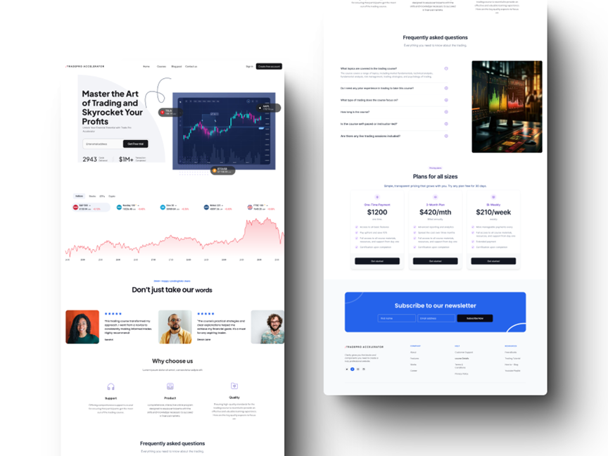
Hero Section
Purpose: Capture attention with a bold headline and a prominent call-to-action.
Design: A large headline introduces the platform’s core value, followed by a call-to-action button (“Get Free Trial”), placed centrally for immediate visibility. Real-time data (e.g., Tesla, Bitcoin, Apple) is displayed to showcase credibility and engage users visually.
Real-Time Data Section
Purpose: Provide users with live trading insights.
Design: Stock and market data is displayed in buttons with vibrant icons and a dark-themed graph for contrast. This section uses a horizontal layout for easy scanning.
Testimonials Section
Purpose: Build trust through user reviews.
Design: Modular testimonial cards with user images and star ratings in a three-column layout, ensuring that users can quickly see social proof without overwhelming the design.
Pricing Plans Section
Purpose: Present transparent pricing options.
Design: Three-column pricing cards, color-coded for differentiation, with each card containing a call-to-action button to encourage sign-ups.
Key UI Design Elements on the Homepage
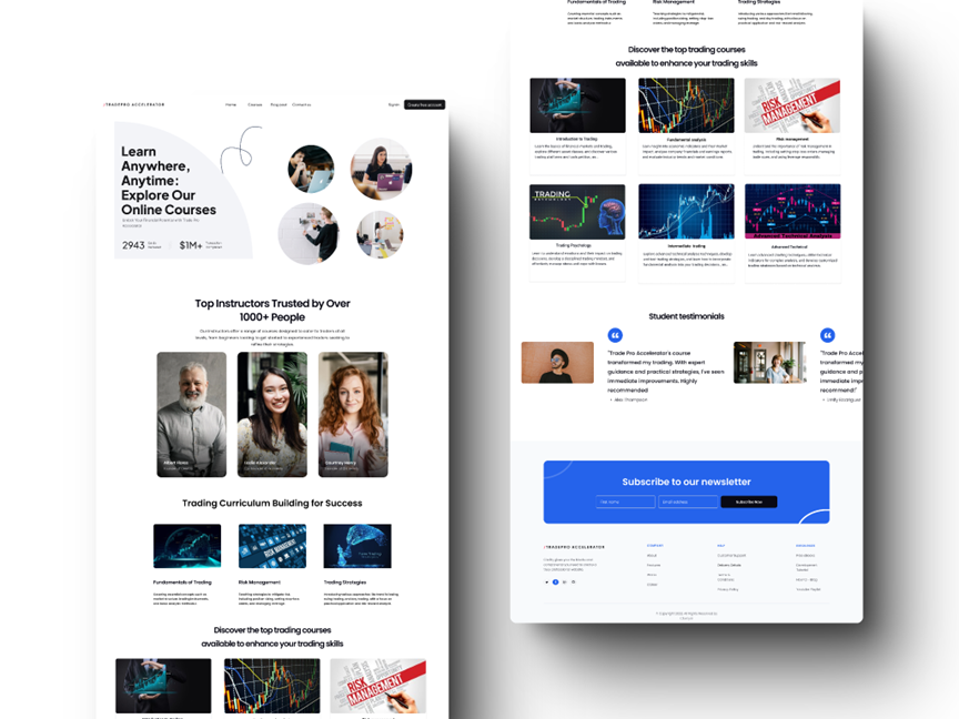
Courses Page
Purpose: Showcase educational offerings and guide users to select the right trading course.
Design: Course cards are arranged in a grid layout with icons and hover effects to provide quick previews. Instructor profiles add credibility by including high-quality images and titles. The consistent use of flat icons and clean typography ensures that the course categories are easy to scan and select.
Blog Page
Purpose: Provide valuable trading insights and educational content.
Design: Featured articles are displayed with large, engaging visuals and bold headlines. The use of a grid-based card layout for blog posts ensures consistency while keeping the content organized and easy to browse. Each post includes a thumbnail image, title, and short description, ensuring visual hierarchy and readability.
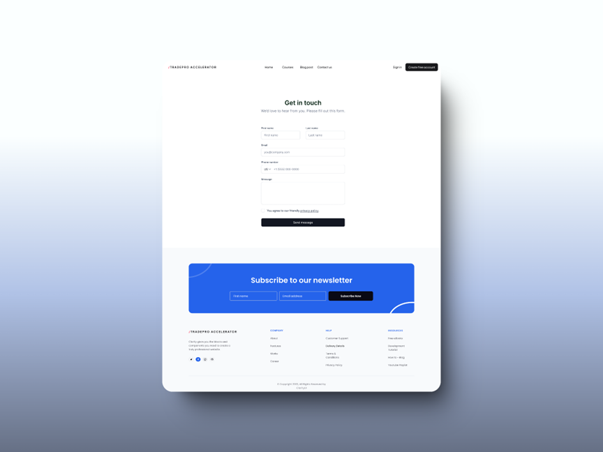
Contact Us Page
Purpose: Enable users to easily reach out for support or general inquiries.
Design: A minimalist contact form layout ensures ease of use. The form contains only the essential fields (name, email, message) with a large, contrasting CTA button ("Send Message") for clear action. The newsletter sign-up is prominently placed at the bottom of the page with bold colors, encouraging users to stay engaged with platform updates.
Other Key Pages
Visual Design Choices
- Color Palette: The use of a clean white background with blue accents for action items ensures clarity. Black is used for key CTAs, making them stand out.
- Typography: A modern, sans-serif typeface is used throughout the platform for both headings and body text, ensuring legibility and a professional aesthetic.
- Icons & Imagery: Flat, minimalist icons are used to represent features and categories. High-quality images are employed in testimonials and instructor profiles to add a human touch.
Conclusion
The TradePro Accelerator homepage and supporting pages were designed with a focus on clarity, simplicity, and visual appeal. Each page guides users through the platform’s core functionalities—from signing up, exploring courses, and accessing blog content to contacting support—while maintaining a cohesive and modern design language. Every design decision, from the hero section to the pricing plans, ensures users can navigate easily, engage with the platform, and take action.