Traveler Hotel App
Project Overview
The Traveler Hotel app simplifies the hotel booking process in Ethiopia by providing users with an intuitive platform to find nearby hotels, compare prices, and make last-minute bookings—all within a few taps. With real-time data, users can easily filter by price, star rating, and amenities to find the best option.
Platform
Mobile App
Role
Product Designer
Tools Used
Figma
Team
Designer, Software Developer


Problem Statement
The Challenge: Travelers often face the difficulty of finding reliable information about available hotel rooms in Ethiopia, especially when traveling on short notice. They typically have to visit multiple websites or contact hotels directly, making the process time-consuming and frustrating.
What makes this different from other travel apps?
The Traveler Hotel app aggregates real-time hotel room availability in one easy-to-use platform. With location-based services and comprehensive filtering, the app streamlines the process of finding and booking the perfect room, saving users time and effort.
Research & Insights
Over the course of 7 months, we conducted a combination of surveys, interviews, and user testing to understand the core challenges travelers faced when booking hotels in Ethiopia. Our goal was to gather quick, actionable insights to shape the app’s core features.
Key Findings
- 87% of users base their hotel choice on price and location.
- 90% emphasized the need for a fast way to find hotels near key landmarks or workplaces.
- Existing platforms often led to frustration due to fragmented information and a lack of reliable, last-minute booking options.
Our Hypothesis
“Travelers need a simplified, reliable app that provides real-time hotel availability, focusing on price and location to reduce booking time and stress.”
Key Findings
- Surveys: Collected over 200 responses to gather insights on booking behavior and preferences.
- Interviews: Conducted 15 interviews with frequent travelers to dig deeper into pain points and ideal solutions.
- Usability Testing: Tested wireframes and prototypes, refining the app design over several iterations based on direct user feedback.
Actionable Insights
The research led to clear design priorities:
- Real-time availability was critical to solving last-minute booking challenges.
- Filters for price and location allowed users to quickly find the most relevant options.
- A streamlined booking flow reduced user frustration, making the process faster and easier.
Ideation and Wireframing:
Based on the insights from my research, I began brainstorming solutions that would address the core user needs—price sensitivity, location-based searches, and real-time availability. I started by sketching out basic user flows and creating low-fidelity wireframes to visualize how these features could come together.
- Wireframes: My initial wireframes focused on simplifying the user journey by reducing the number of steps needed to search for and book a hotel.
- User Testing: I conducted early user tests on the wireframes to gather feedback quickly and make necessary adjustments early in the design phase.
High-Fidelity Prototypes
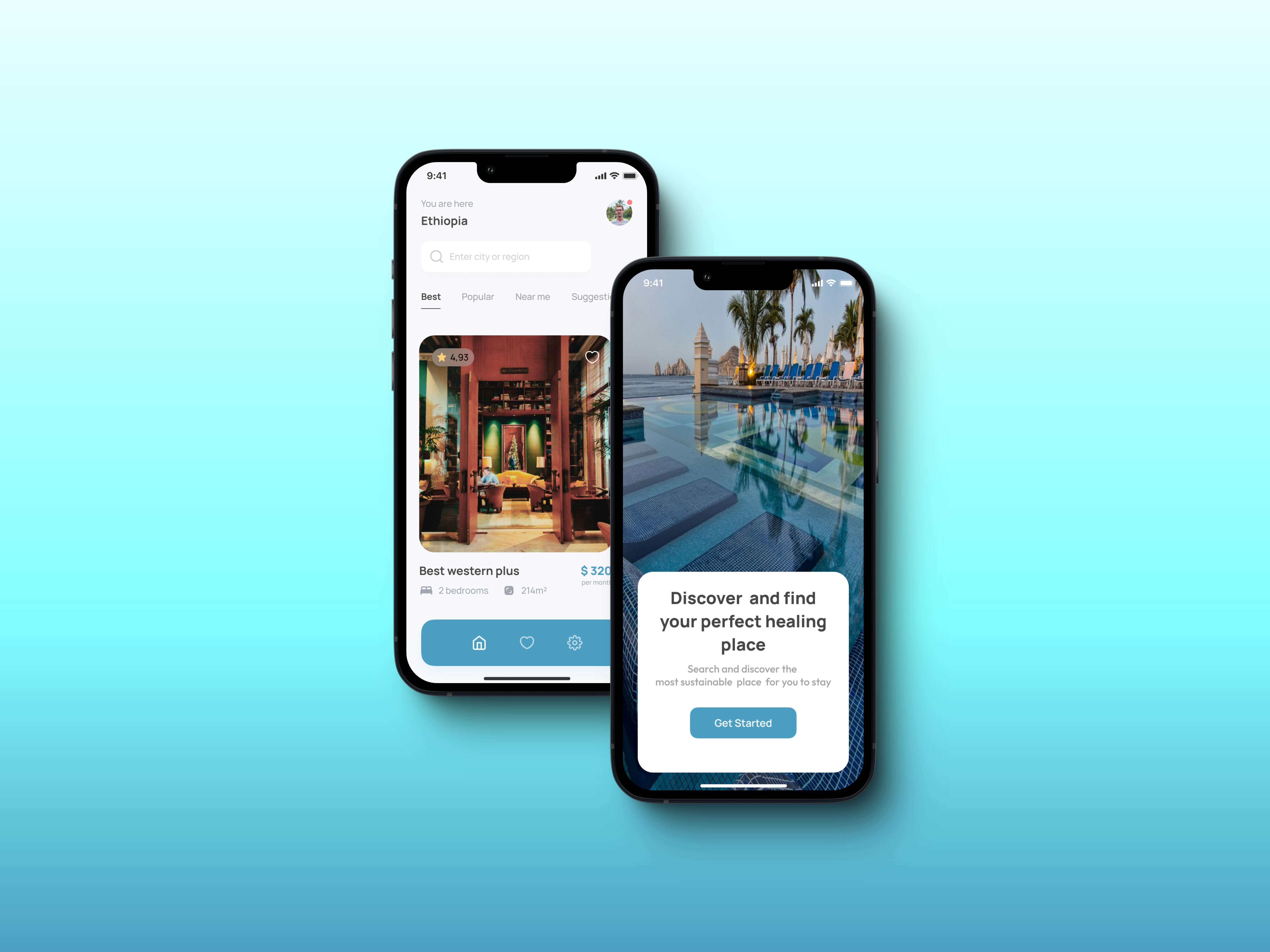
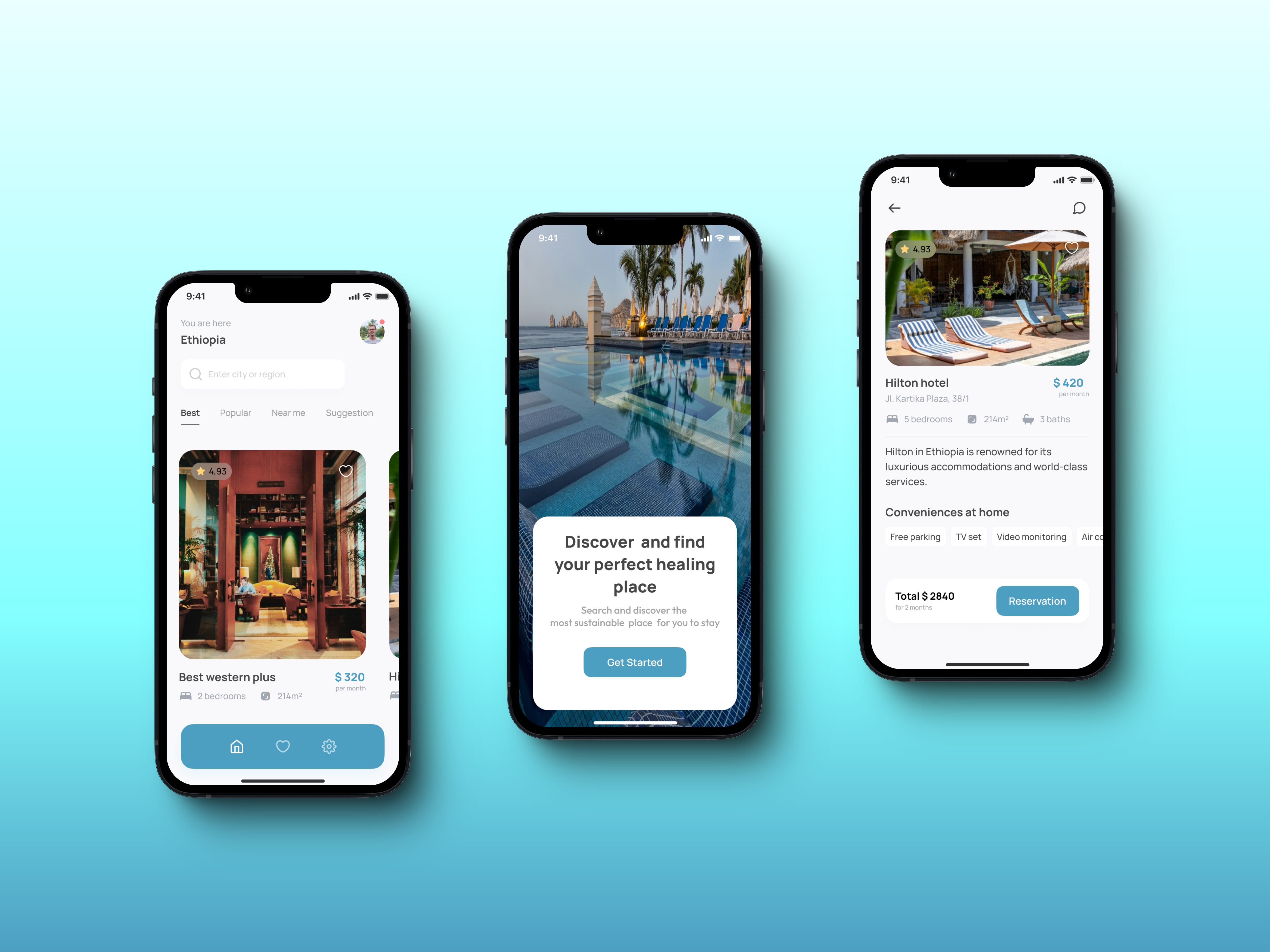
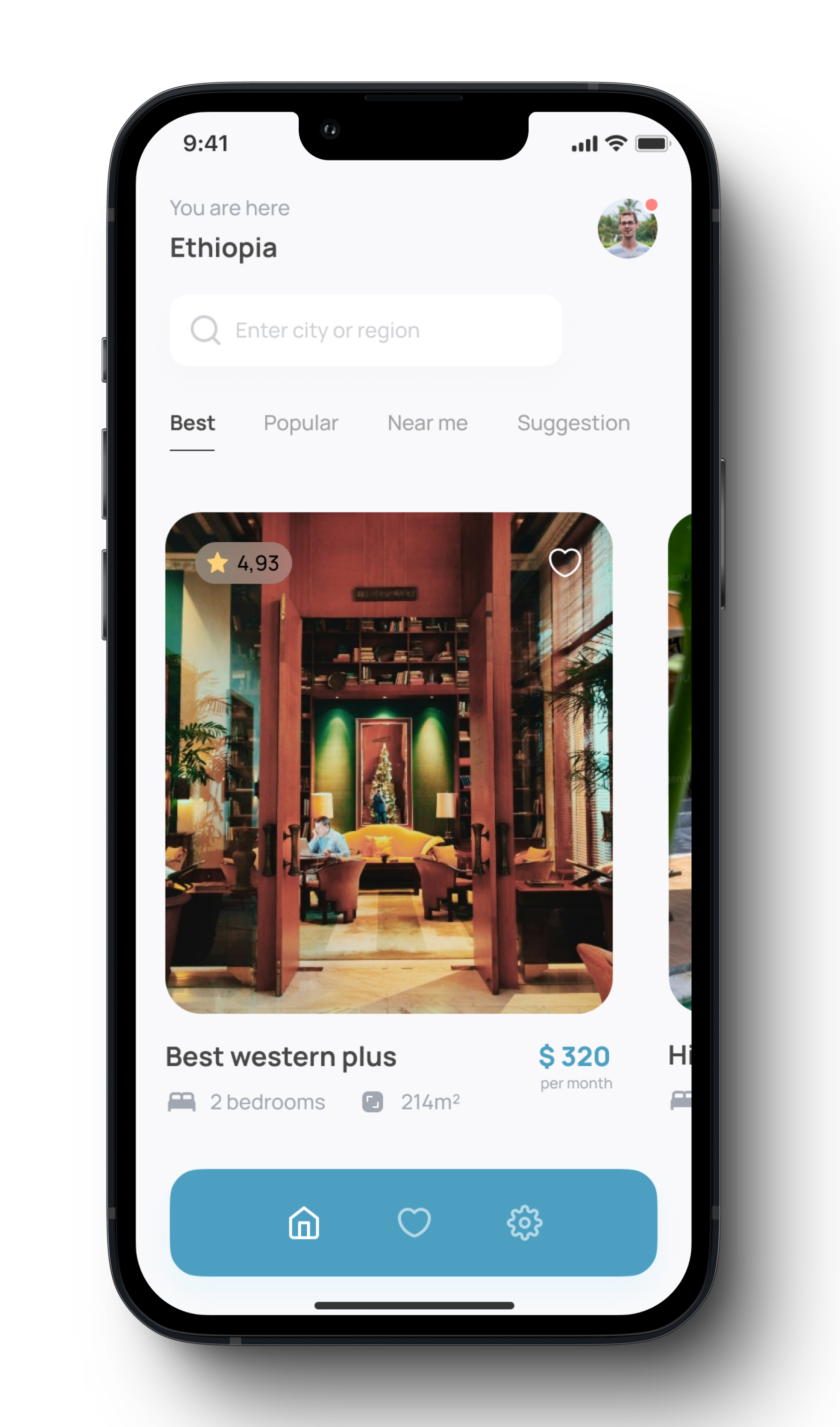
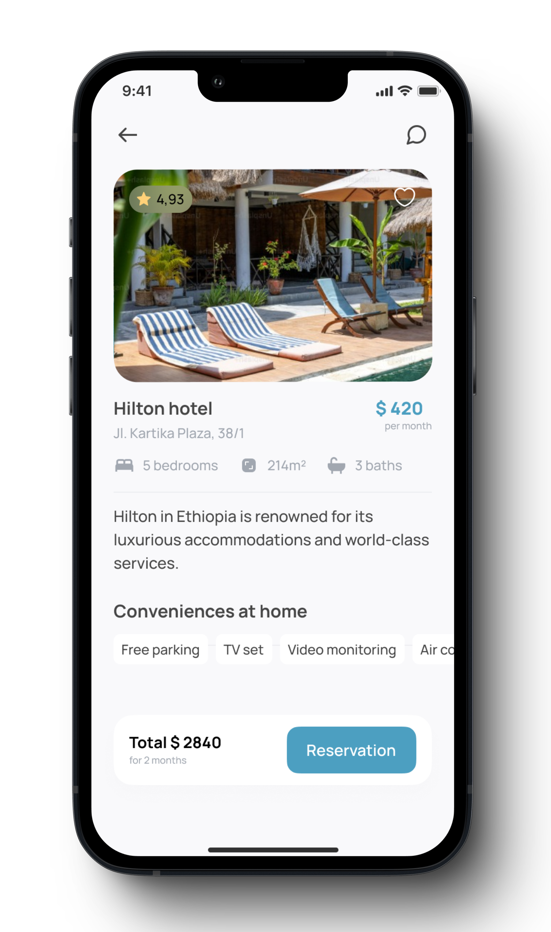
After validating the core user flows, I moved on to creating high-fidelity prototypes using Figma. These prototypes emphasized both the visual design and user experience, ensuring seamless navigation. I designed key screens such as the homepage, payment flow, reservation, and confirmation screens, ensuring that the overall experience was intuitive and visually appealing.
Design Process
- Homepage: I focused on a search-based homepage with quick filters (price, location) that allowed users to easily find nearby hotels.
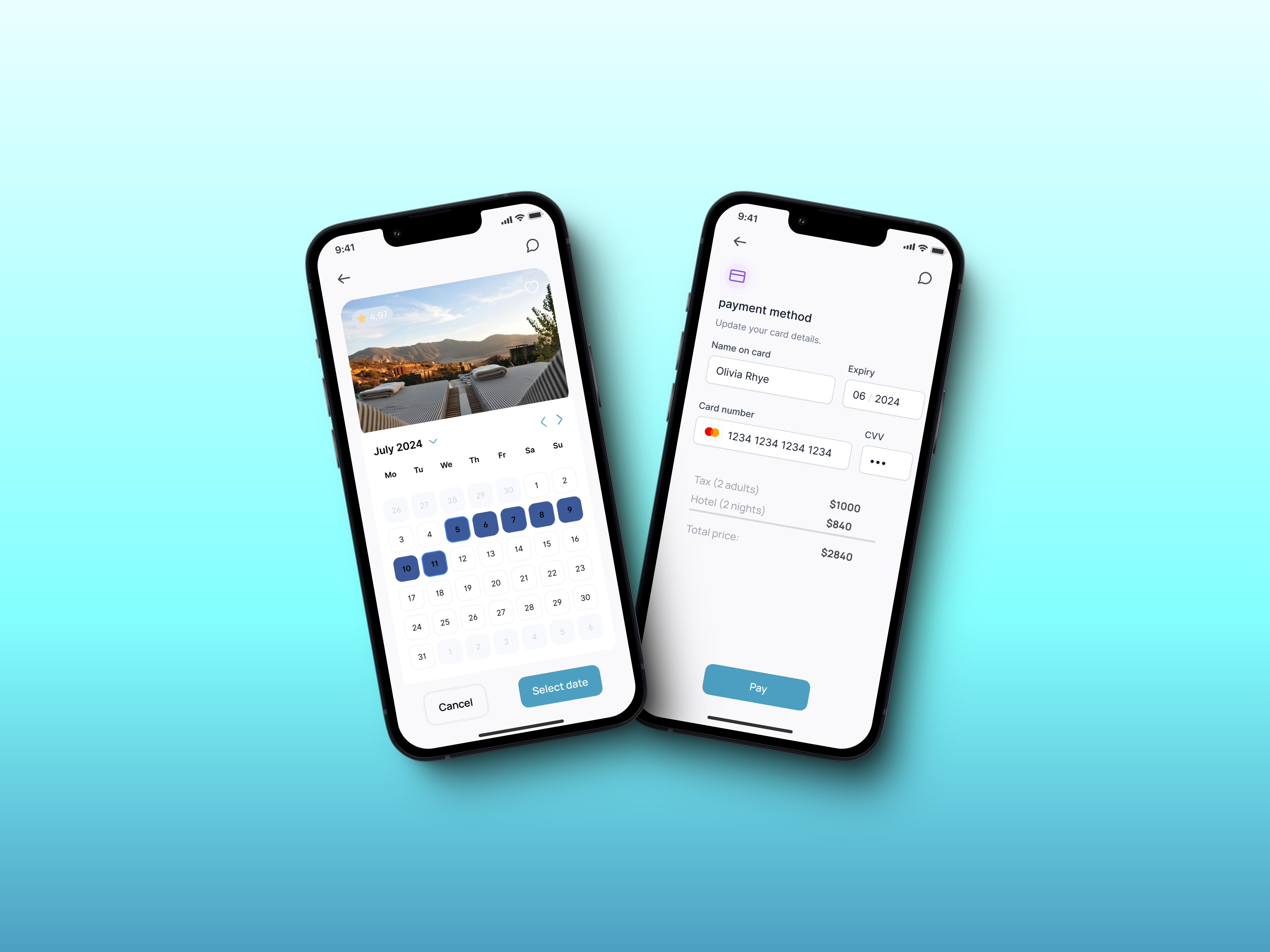
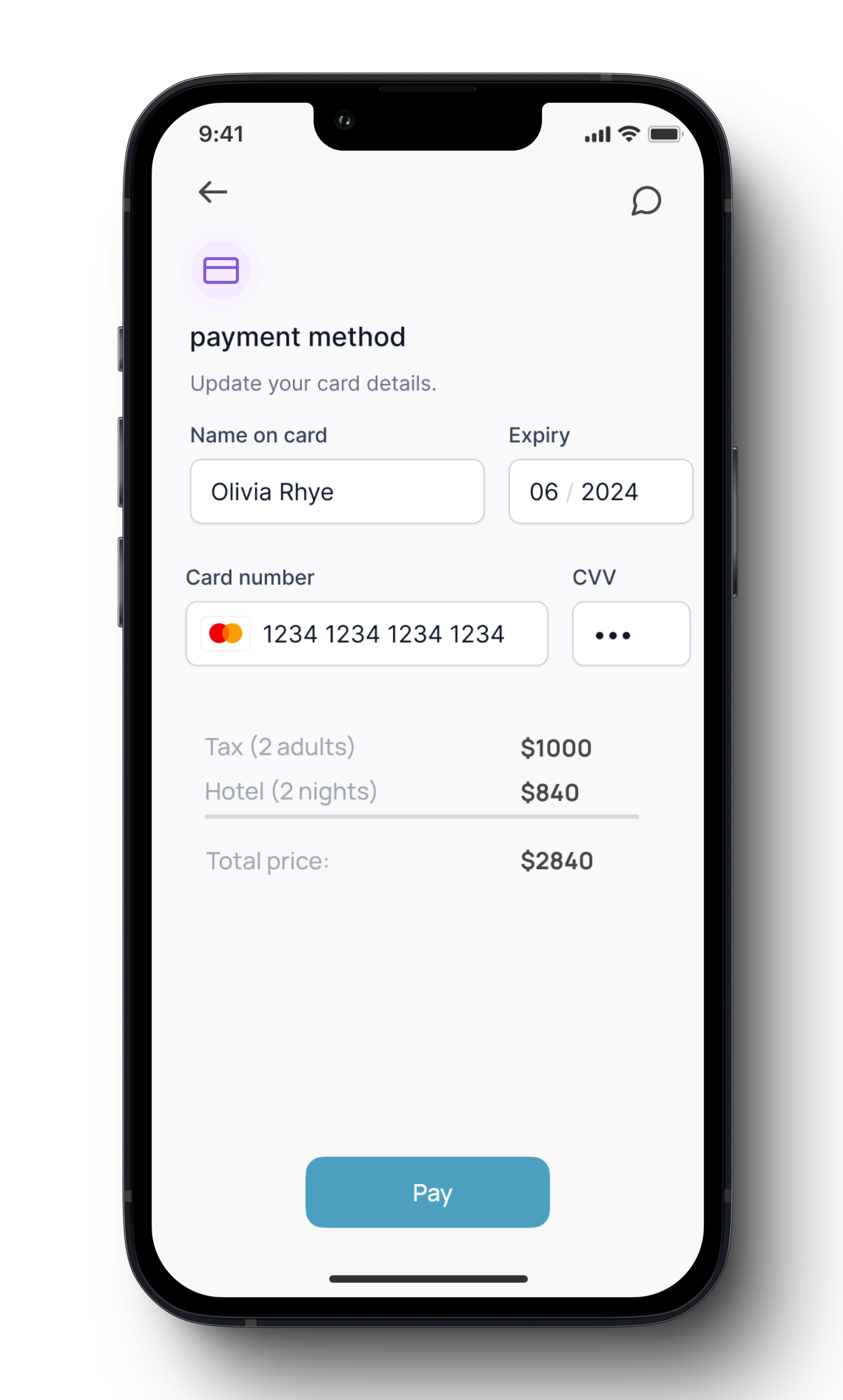
- Payment Flow: I simplified the payment process to provide clear instructions and a transparent breakdown of costs.
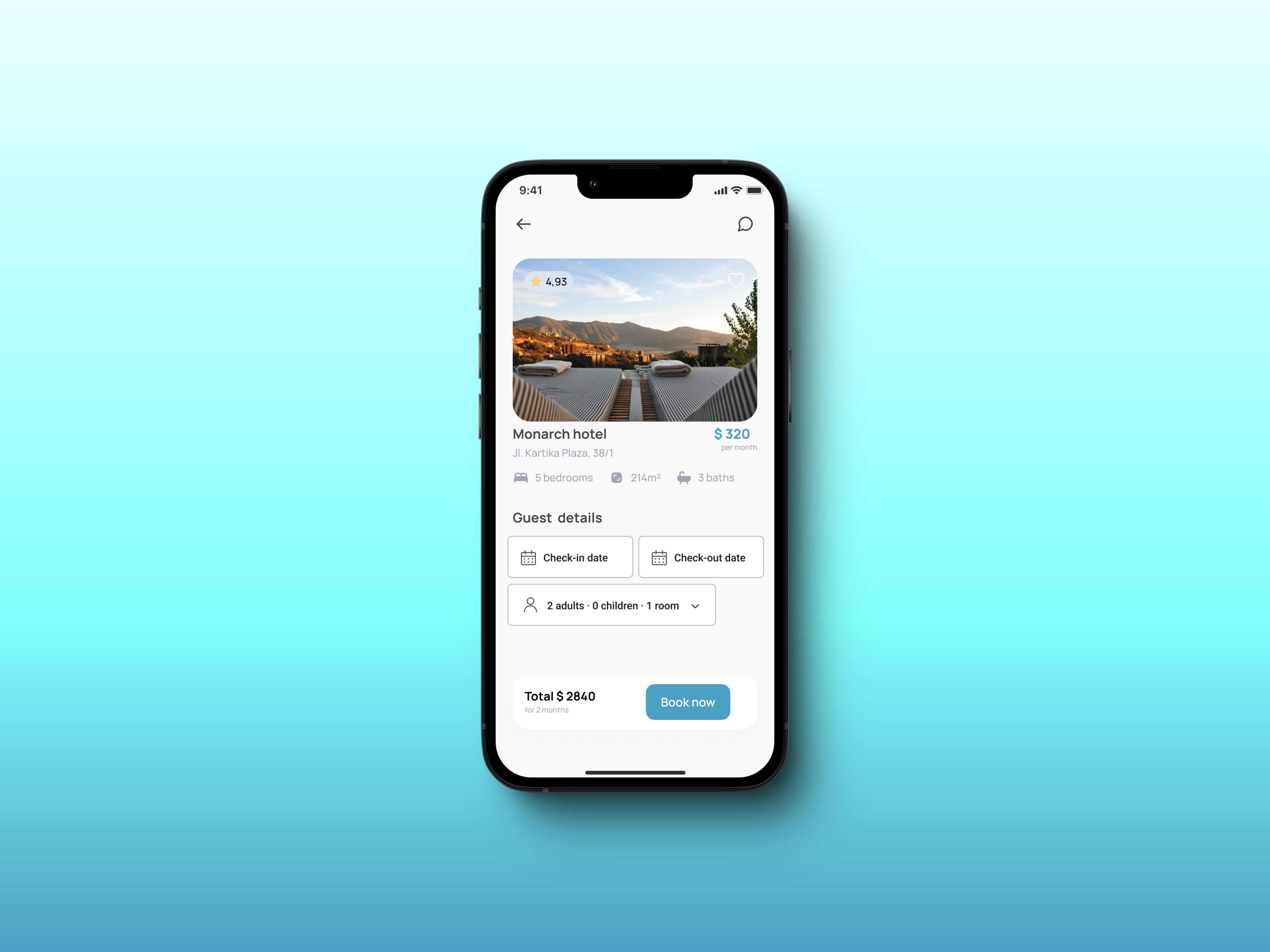
- Reservation Screen: I ensured that important room details, such as amenities, capacity, and guest reviews, were clearly highlighted to help users make informed decisions quickly.
Design Iterations
After testing my high-fidelity prototypes with users, I iterated on the design based on the feedback received. This iterative process included
- Real-time availability was critical to solving last-minute booking challenges.
- Enhancing the payment experience by introducing real-time card validation and ensuring a secure, smooth transaction process.
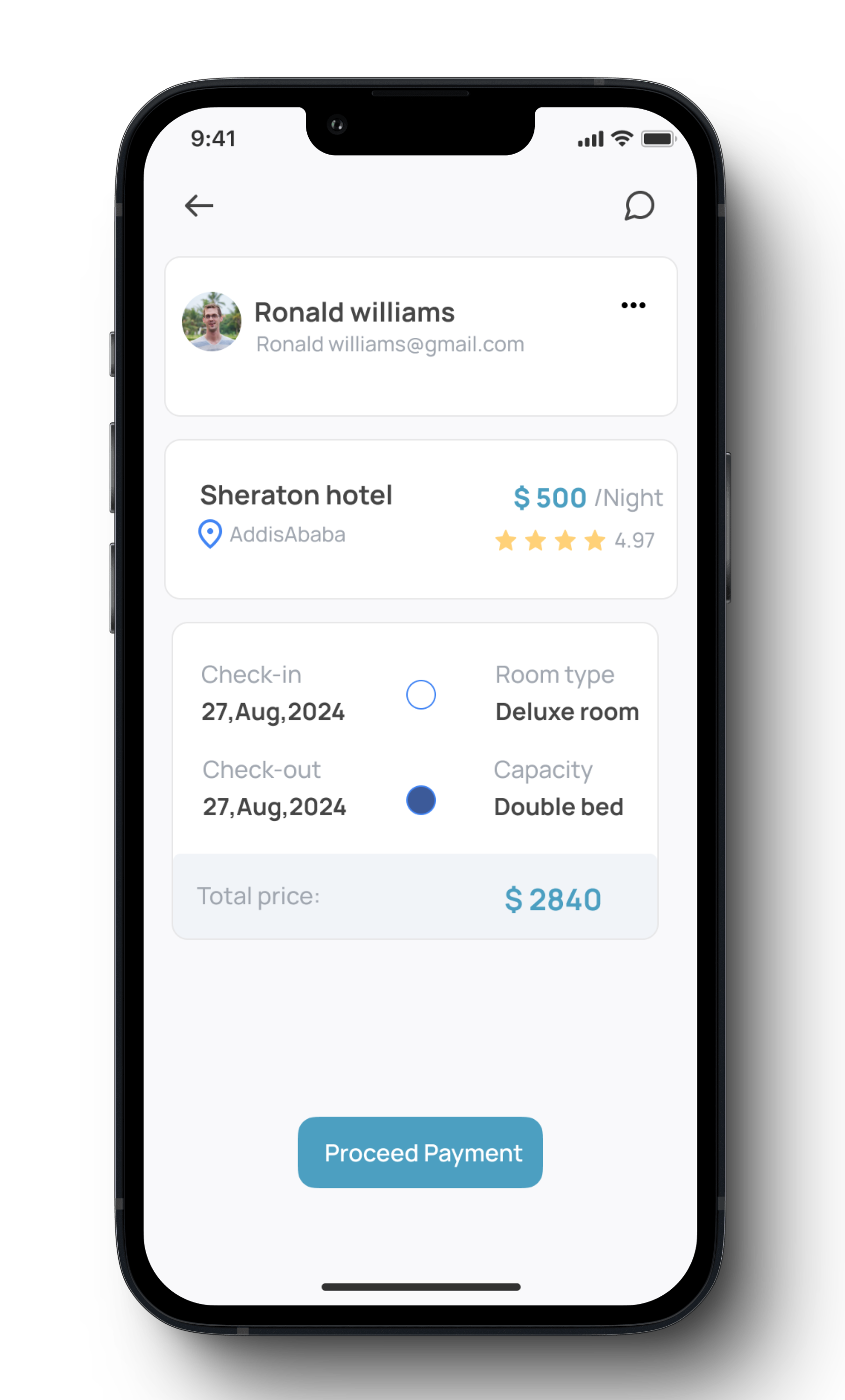
- Simplifying the confirmation screen to make it clearer, with easy access for users to modify bookings if needed.
Key Screens & Features
This section highlights the main screens of the Traveler Hotel app and explains how each feature was designed to solve specific user pain points. I used user feedback and testing results to refine these screens for an optimal user experience.
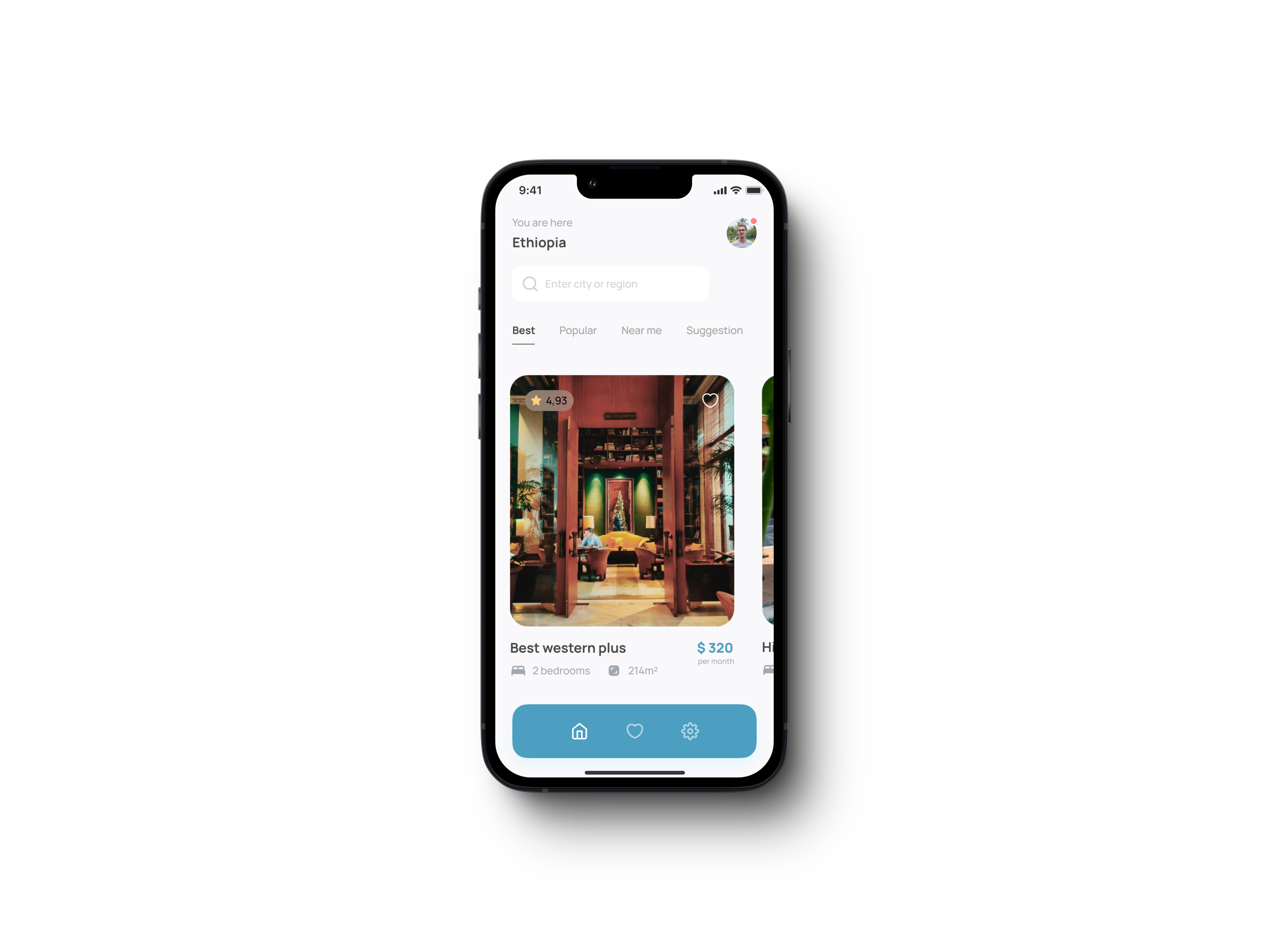
Homepage
Feature: Location-based search with filters for price, amenities, and hotel rating.
Goal: Simplify the process of finding relevant hotels by allowing users to filter results quickly based on their preferences.
- Users can see nearby hotels using geolocation.
- Quick filters are easily accessible to adjust results for price range, amenities, and star ratings.
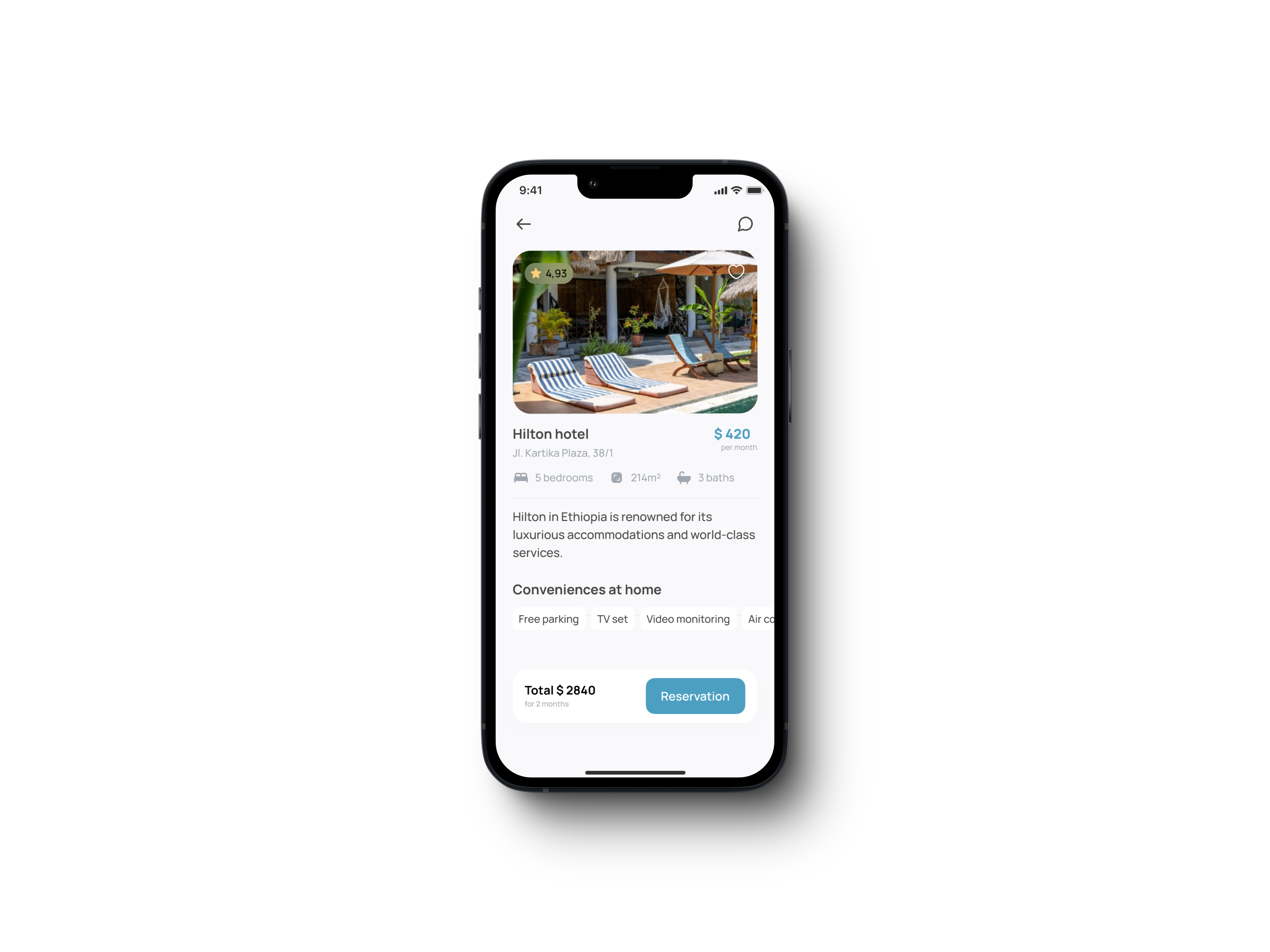
Rooms Overview Screen
Feature: Visual listing of available rooms with key details (price, location, amenities).
Goal: Provide users with the essential information needed to make an informed decision in a quick and easy-to-read format.
- Each listing includes an image, name, price, and a brief description.
- The user can sort or filter the listings to prioritize their needs.
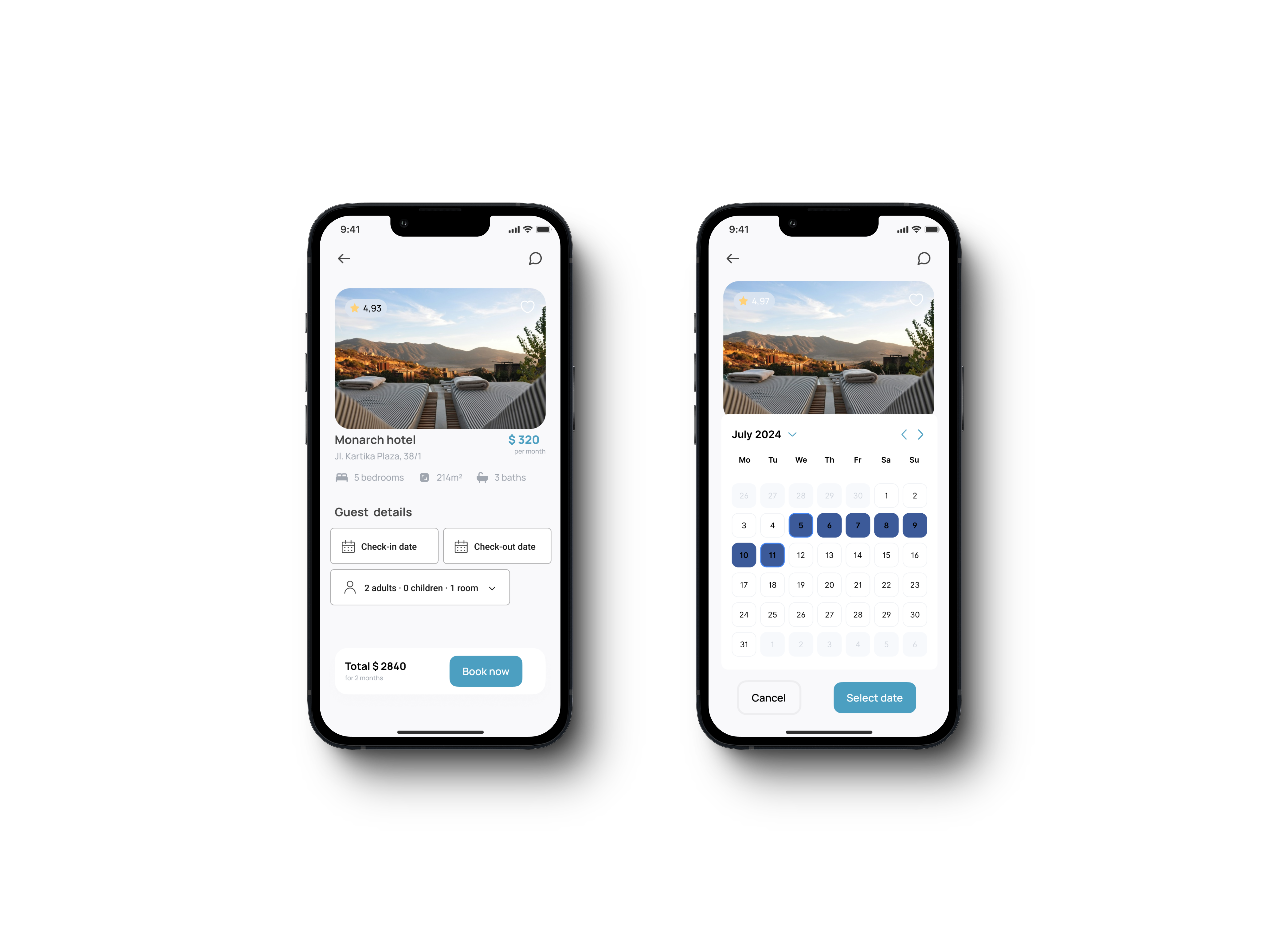
Reservation Screen
Feature: Room details, including amenities, guest reviews, and availability.
Goal: Enable users to explore room options in more detail and see relevant information to ensure they select the right room.
- Users can read guest reviews and check room amenities.
- A prominent “Book Now” button makes the booking process straightforward.
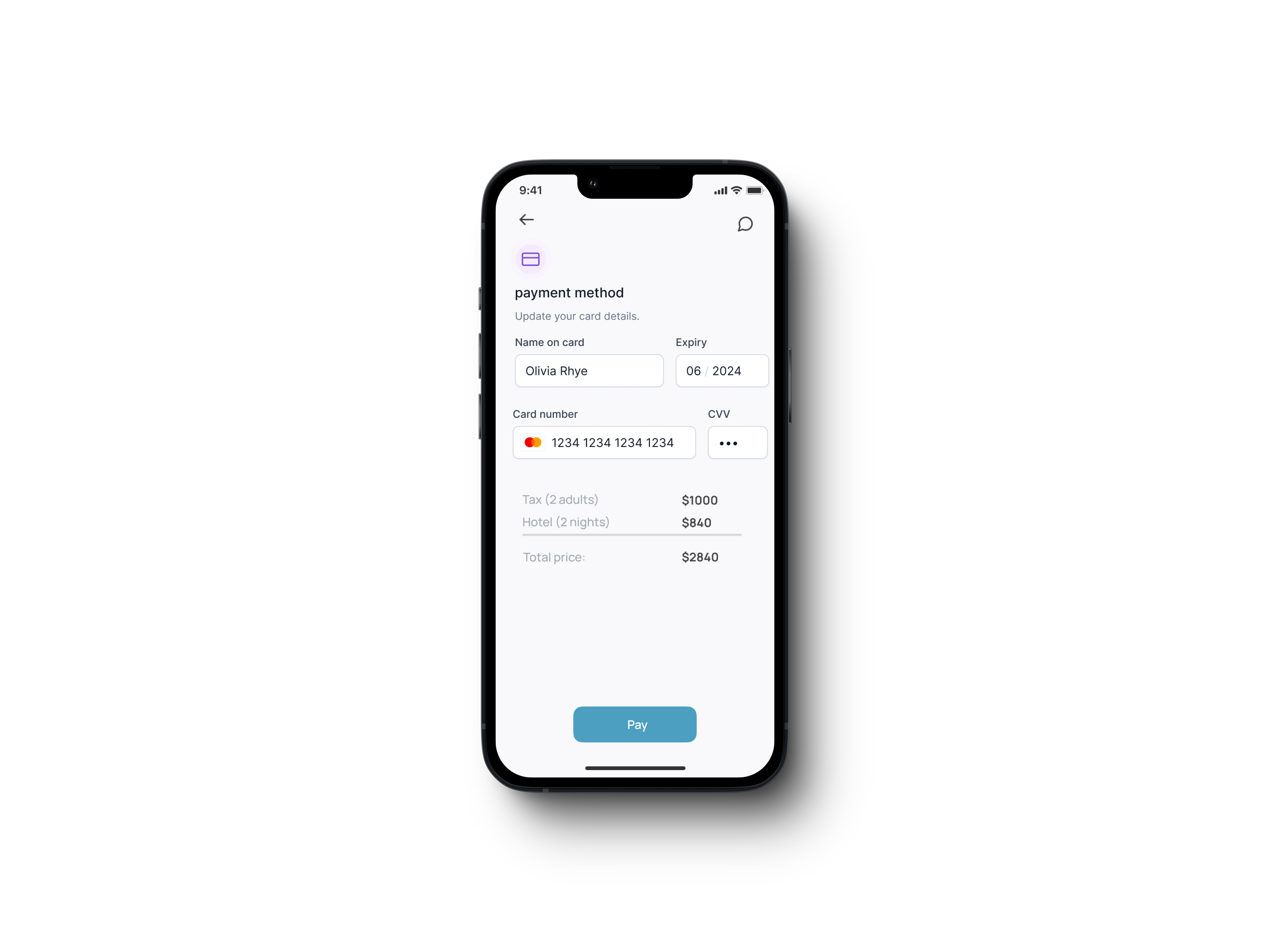
Payment Screen
Feature: A simplified payment form with real-time card validation and a summary of the booking cost.
Goal: Provide a smooth, secure, and transparent payment process that reassures the user while completing the booking.
- Users can save payment details for future use.
- A detailed cost breakdown (including taxes) is shown before confirming payment.
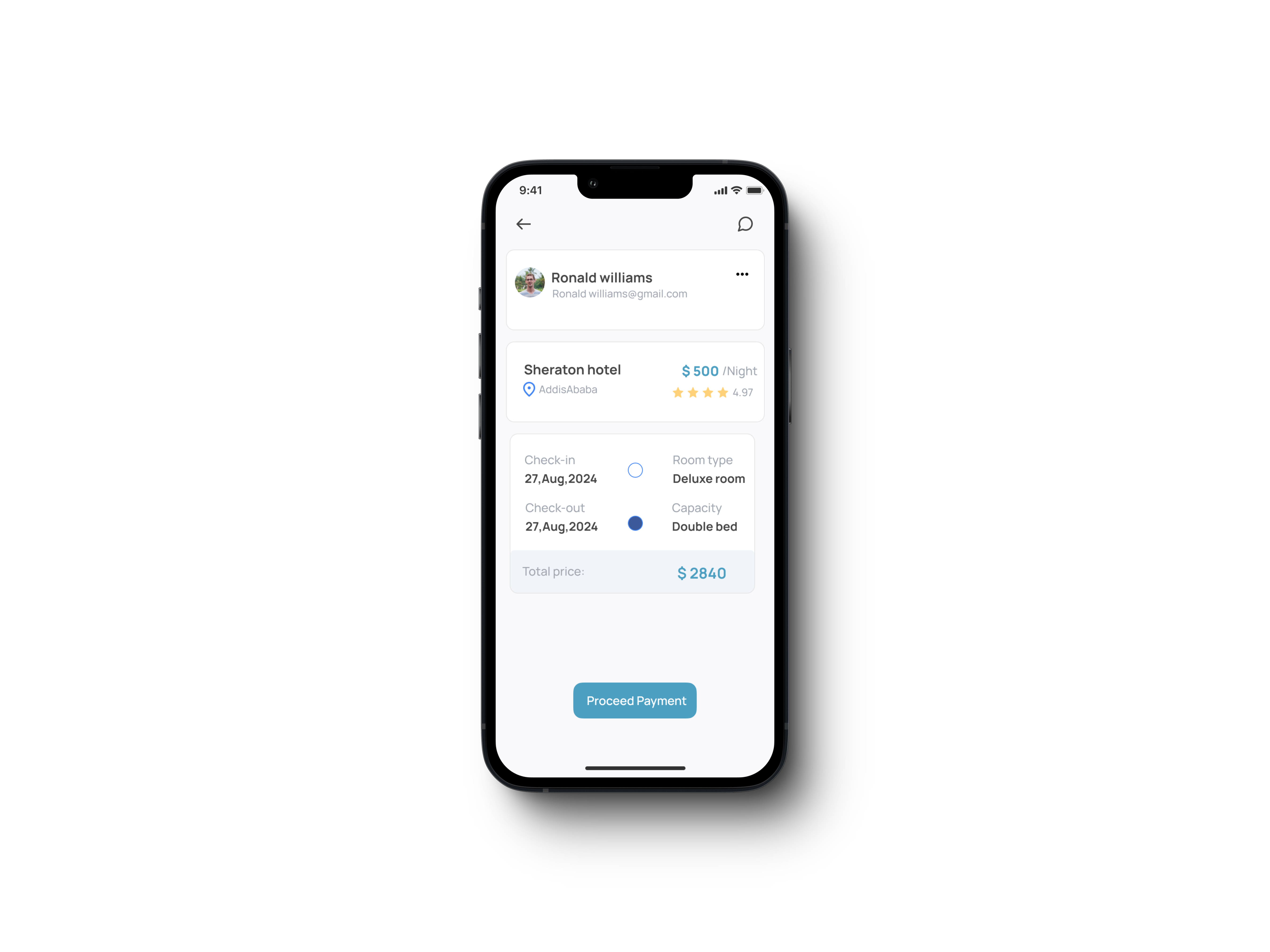
Confirmation Screen
Feature: Clear booking summary with an option to modify details.
Goal: Confirm all details before finalizing the booking and allow users to make changes if necessary.
- Users see a summary of the booking (dates, room type, total cost).
- A “Modify Booking” option allows for quick adjustments before confirming.
Results & Impact
After several rounds of testing and iteration, the Traveler Hotel app successfully addressed the key pain points faced by users. Through focused research and user-centered design, the following outcomes were achieved:
Key Metrics
- Average Session Time: Users spent an average of 15 minutes per session, exploring room options and completing bookings, which indicated high engagement.
- User Satisfaction: Post-test surveys showed an 85% satisfaction rate among users, with many praising the app’s ease of use and quick booking process.
User Feedback


Key Successes
- Real-Time Availability: The real-time availability feature greatly reduced the time users spent searching for hotels, improving the overall booking experience.
- Customizable Filters: Price and location filters were the most used features, allowing users to quickly find the best options based on their needs.
- Streamlined Payment Process: The simplified payment flow reduced user friction, resulting in a high booking completion rate and increased user trust.
Reflections & Learnings
Working on the Traveler Hotel app was an insightful experience that deepened my understanding of user-centered design and iterative development. Over the course of 7 months, I learned valuable lessons that I’ll carry forward into future projects.
Importance of Iteration
This project highlighted how critical it is to test early and often. By continuously gathering user feedback, I was able to refine the design, reducing friction in the booking process and addressing real user pain points. Iterating based on feedback allowed me to create a solution that was both functional and intuitive.
Simplifying Complexity
One of the biggest challenges was simplifying the hotel booking process without sacrificing important functionality. By focusing on the core user needs—price, location, and real-time availability. I was able to streamline the app, making it efficient yet powerful. This balance of simplicity and depth is something I’ll prioritize in future designs.
Collaboration Across Teams
Although I was the primary designer, working closely with developers taught me the value of cross-team collaboration. Having open communication ensured that the design could be implemented effectively, and it gave me a better understanding of the technical constraints and possibilities.
User Empathy
Understanding the users’ frustrations and needs was key to creating a successful product. Throughout the project, I put myself in the users’ shoes, ensuring that every feature solved a real problem and enhanced their experience. This empathy-driven approach is now a core part of how I design.
Future Applications
Moving forward, I’ll apply these learnings to other projects, particularly in balancing user needs with business goals and testing designs in real-world scenarios. This project has strengthened my ability to adapt quickly and deliver impactful solutions in any environment.
Conclusion
The final design offers a sleek, user-friendly experience for managing finances, accessible across devices. By focusing on clean layouts, modular sections, and ease of integration, the project balances complex functionality with a user-centric approach. The dark theme, mobile accessibility, and localization were key decisions that enhanced the usability and overall experience for users.
