Unlocking the Secrets of Success: The TradePro Adventure
Overview
As the Product Designer leading the development of TradePro Accelerator, I was tasked with creating an innovative online learning platform that would cater to traders at all experience levels. The project aimed to address a significant gap in the market: existing platforms were either too simplistic, leaving users underprepared, or overly complex, causing frustration and discouragement. Our mission was to develop a platform that bridges this gap, offering an intuitive, engaging, and comprehensive learning experience that empowers aspiring traders.
Role
- Visual Design
- User Experience
- Prototyping
Teams Involved
- Frontend Developer
- Backend Developer
- Product Designer (my role)
Problem Statement
The trading education landscape was missing a critical element: a user-friendly, comprehensive platform specifically designed to support the learning journey of aspiring traders. The available options were either too basic, failing to offer sufficient depth, or too intricate, overwhelming users with complexity. This imbalance left many traders feeling disheartened and unsupported, highlighting the need for a solution that could effectively engage and educate users at various experience levels.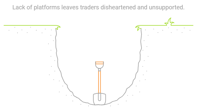
Methodology Brief
To develop the TradePro Accelerator platform that effectively meets the needs of traders in the UAE and around the world, I adopted a mixed-methods research approach, combining qualitative and quantitative techniques. This dual approach allowed me to gain a comprehensive understanding of both the emotional challenges traders face and the practical requirements essential for their success.
Understanding Local User Needs in the UAE
In the UAE, I focused on cultural preferences, language, and user behavior to ensure the platform resonates with traders. This research shaped the design and features.
Cultural Preferences:
Focus groups highlighted users' preference for designs that felt familiar and culturally relevant. We incorporated geometric patterns and architectural elements inspired by UAE heritage, creating a comfortable, connected experience.
As Fatima expressed: “It’s important the platform feels like home.” This culturally informed design boosted engagement, as users felt it respected their identity.
Fatima, one of our focus group participants, expressed her feelings: “It’s important that the platform feels like home. I want to see something that represents my culture.” This culturally attuned design led to increased engagement, as users felt the platform respected and reflected their local identity, boosting their confidence in navigating it.
Engaging with Traders
I conducted in-depth interviews to uncover traders' pain points. Fatima, like many, struggled with the steep learning curve of existing platforms, saying: “I always gave up due to the complexity.” Her feedback shaped our focus on ease of use and cultural relevance.
Ahmed, an experienced forex trader, emphasized the need for real-time simulations: “I need to practice without losing money.” This insight led to the creation of risk-free practice accounts, allowing users to build confidence by practicing strategies in a safe environment.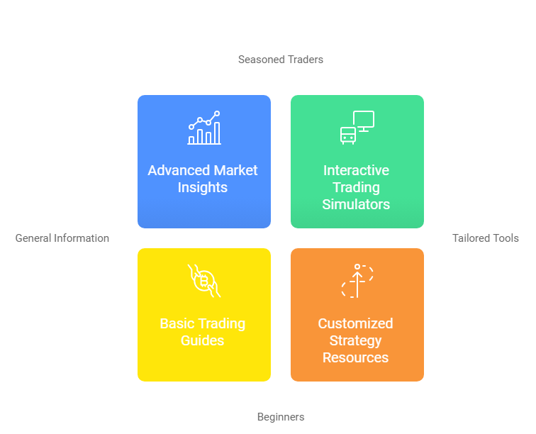
Surveying a Wider Audience
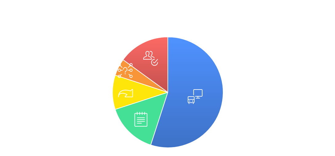
I expanded the research with an online survey of 130 traders worldwide, validating the insights from interviews. 55% of users shared Fatima’s struggle, inspiring the creation of interactive tools for hands-on learning. Additionally, 15% of users stressed the need for structured educational content, guiding the curriculum’s development to ensure relevance and value for traders.
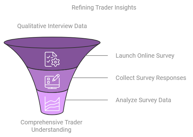
Thematic Analysis Process
To translate the qualitative data into actionable insights, I employed a thematic analysis process. This involved:
- Reading and Reflection: I thoroughly reviewed each interview transcript, paying close attention to traders’ experiences and challenges.
- Highlighting Key Points: I noted significant phrases and recurring themes, such as information overload, need for interactivity, and user experience challenges.
- Identifying Patterns: I grouped related ideas into broader themes relevant to the platform’s design:
- Information Overload: Users felt overwhelmed, highlighting the need for streamlined content.
- Interactivity: Demand for risk-free practice tools led to simulated trading features.
- User Experience: Navigation issues emphasized the need for intuitive design.
- Validating Themes: I cross-checked these themes to ensure they accurately represented traders’ feedback, allowing these insights to drive the design decisions for TradePro Accelerator.
Analyzing Insights
With both qualitative and quantitative data, I identified the key features that would define TradePro Accelerator:
- Interactive Tools: A majority (55%) expressed a desire for practice tools without financial risk, which became a critical feature for TradePro Accelerator.
- Comprehensive Content: 15% of users stressed the need for in-depth, well-organized content, reinforcing structured learning.
- Ease of Use: 10% prioritized simplicity and intuitive navigation, key factors for user retention on the platform.
- Community Engagement: 5% valued forums and peer support, highlighting the importance of social learning features in TradePro Accelerator.
- Progress Tracking: 15% emphasized the need for tools to track learning progress, enhancing user motivation and engagement.
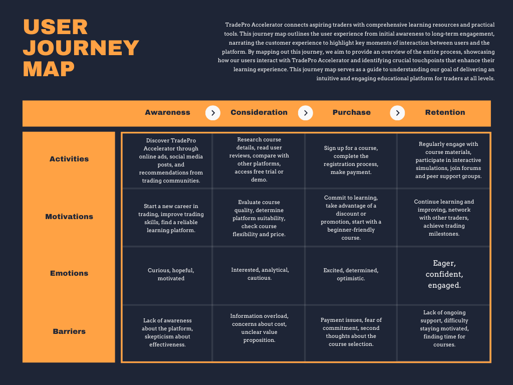
User Journey: Mapping the Path to Success
Understanding users’ needs was key to designing a seamless user journey. When new users, like Fatima, join TradePro Accelerator, they may initially feel overwhelmed by the complexities of trading. However, the platform’s simple navigation and intuitive tools guide them step by step. As they progress, their confidence builds, and by the time they reach their first live trade simulation, they feel empowered rather than lost. The transformation from confusion to confidence is central to the platform’s design, ensuring users feel supported throughout their learning experience.
Design Strategy and Implementation
The insights gathered from research and user feedback directly influenced the design of TradePro Accelerator. Key areas of focus were interactive tools, ease of use, structured content, community engagement, and progress tracking, all developed to address users' needs.
Interactive Tools Development
- Key Insight: 55% of users wanted risk-free, interactive tools.
- Solution: Developed simulated trading environments and real-time market scenarios that allow users to practice without financial risk, building confidence through hands-on experience.
- Design Process: Started with wireframes and evolved into high-fidelity prototypes based on user feedback.
Ease of Use
- Key Insight: 10% of users prioritized simplicity and intuitive navigation.
- Solution: Designed a user-friendly interface with clear navigation and clean layouts, supported by guided onboarding to help new users.
- Design Process: Wireframes and usability tests were conducted to refine the navigation flow and ensure seamless interaction.
Comprehensive Content Structuring
- Key Insight: 15% of users expressed the need for well-structured, in-depth educational material to build their knowledge effectively.
- My Solution: I structured the course content to be comprehensive yet accessible, using a modular approach that progressively builds foundational knowledge. Each module includes video tutorials, quizzes, and practical exercises to ensure a balanced learning experience.
- Design Process: I developed detailed course outlines, lesson plans, and sample content, ensuring that both theoretical concepts and practical applications were well-integrated.
Community Engagement Features
- Key Insight: 5% of users valued peer support and forums.
- Solution: Integrated discussion forums and live chat rooms to foster community interaction and collaborative learning.
- Design Process: Developed and refined these features through wireframes and beta user feedback.
Progress Tracking Tools
- Key Insight: 15% wanted tools to monitor learning progress.
- Solution: Designed dashboards, progress bars, and achievement badges to help users track their course progress and stay motivated.
- Design Process: Developed prototypes of the progress tracking tools and conducted usability tests to ensure they were intuitive and effective.

Design Decisions
- User-Centered Design: Intuitive layout that accommodates all user experience levels, providing flexibility through modular learning.
- Information Hierarchy: Critical information is easily accessible, with secondary details placed to support learning without overwhelming users.
- Visual Clarity: Clean sections and consistent card formats make interaction and navigation effortless.
- Interactivity: Features like video tutorials, quizzes, and real-time simulations ensure users stay engaged and motivated to complete their learning journey.
Usability Testing of Wireframes
To ensure that the platform met user expectations, I conducted usability tests with participants to gather feedback on the initial wireframes. Their insights were invaluable in shaping the design improvements.
Wireframe Feedback:
- Navigation Issues: 60% of participants struggled to navigate forum topics due to unclear visual hierarchy and lack of a search function.
- Live Chat Rooms: 70% felt the live chat lacked real-time indicators and user activity statuses, leading to confusion about ongoing conversations.
- Peer Support Groups: 55% found it difficult to distinguish between groups due to similar layouts and minimal descriptions, making it hard to find the right support.
Solutions Implemented
After analyzing feedback, it was clear that improvements were needed in key areas like navigation, content organization, and user flow. This prompted a re-evaluation of the design and user journey.
Visualizing the User Flow:
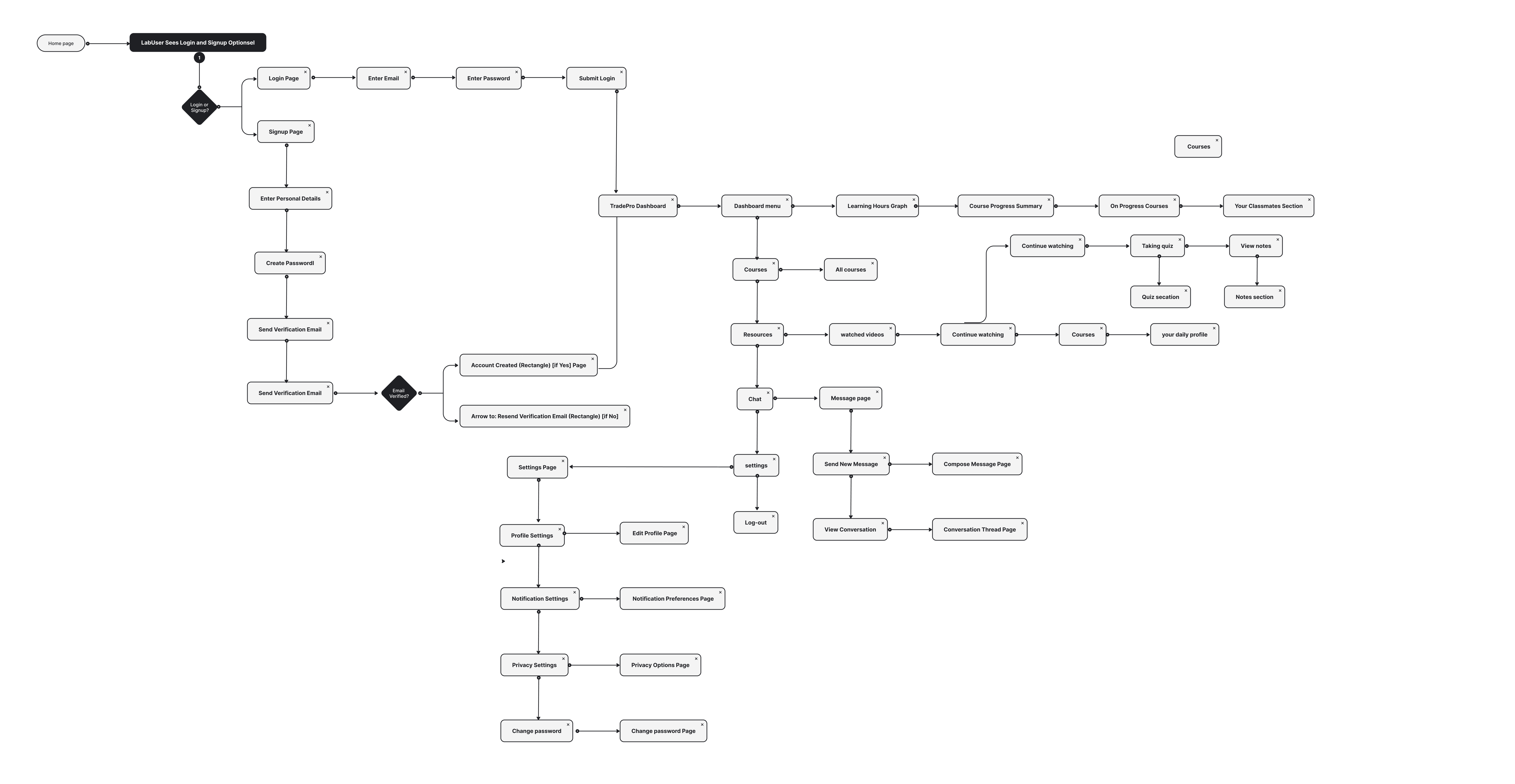
- I created detailed user flow diagrams to visualize the entire user journey from start to finish. These diagrams served as a crucial reference point throughout the design process, ensuring that every design decision aligned with the intended user experience.
- The diagrams featured arrows and connections that clearly illustrated the sequence of actions, decision points, and potential user pathways. This visual representation helped me identify any remaining bottlenecks and make necessary adjustments before final implementation.
After several rounds of wire framing and usability testing, we moved to high-fidelity designs, bringing our concepts to life by incorporating user feedback and ensuring a visually cohesive and functional platform.
Setting the Scene
Transitioning from wireframes to high-fidelity designs was a pivotal step where abstract ideas took tangible form, embodying the final user experience.
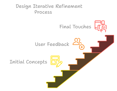
Iterative Refinement
- Initial Concepts: We began by translating wireframes into visually appealing interfaces, selecting a color palette that aligned with the brand and ensured accessibility.
- User Feedback Integration: Design reviews with select users provided invaluable feedback on visual elements like color schemes and interactive components, which we used to refine the designs.
- Final Touches: I polished the final designs, focusing on consistency, button states, and responsiveness to ensure a seamless experience across all devices.
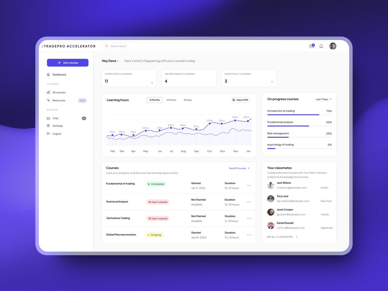
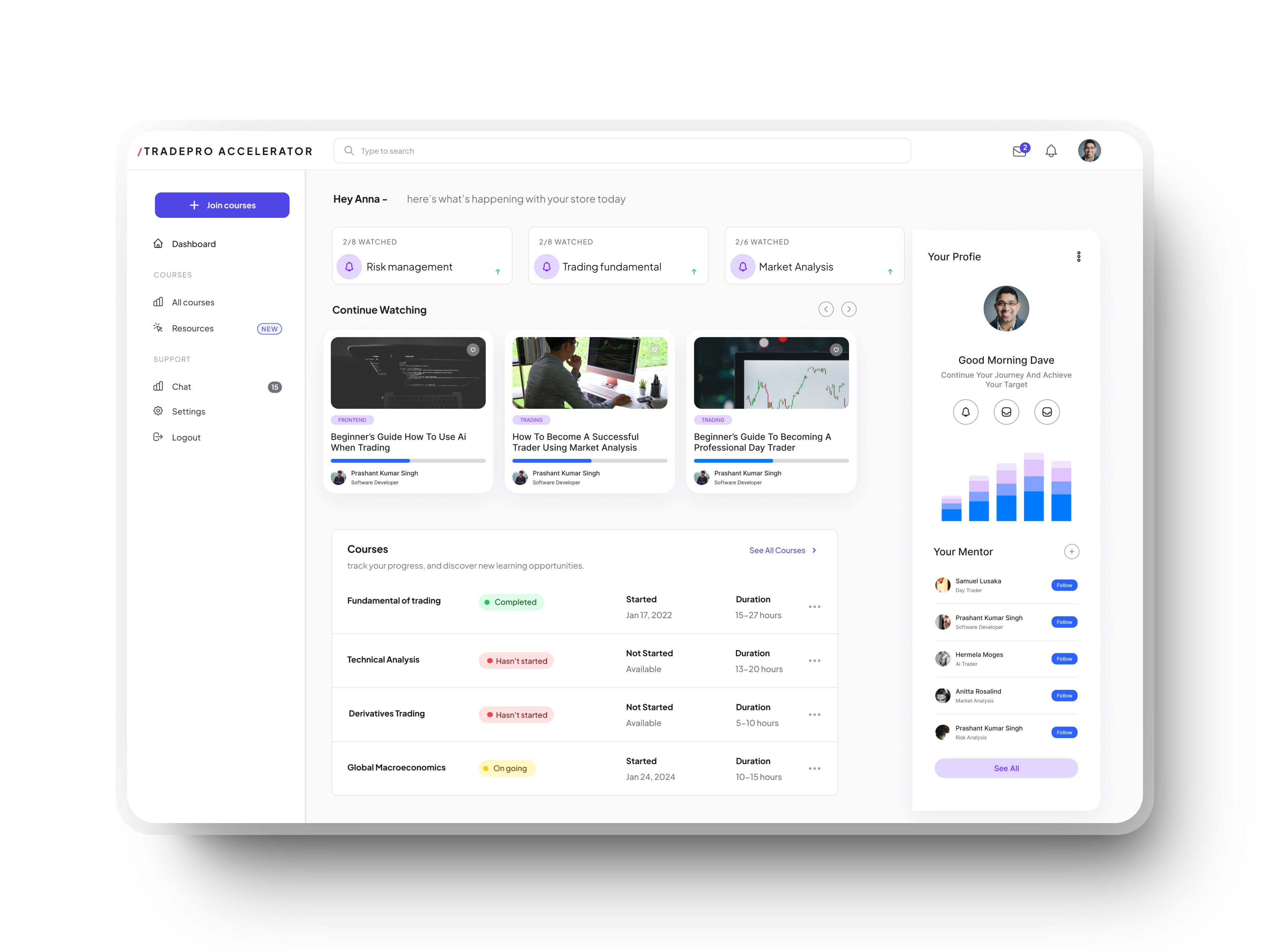
Dashboard Overview
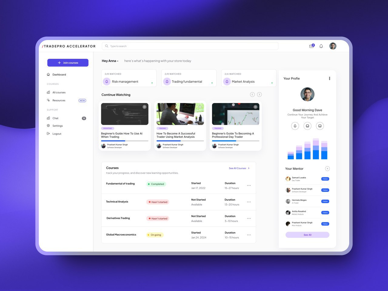
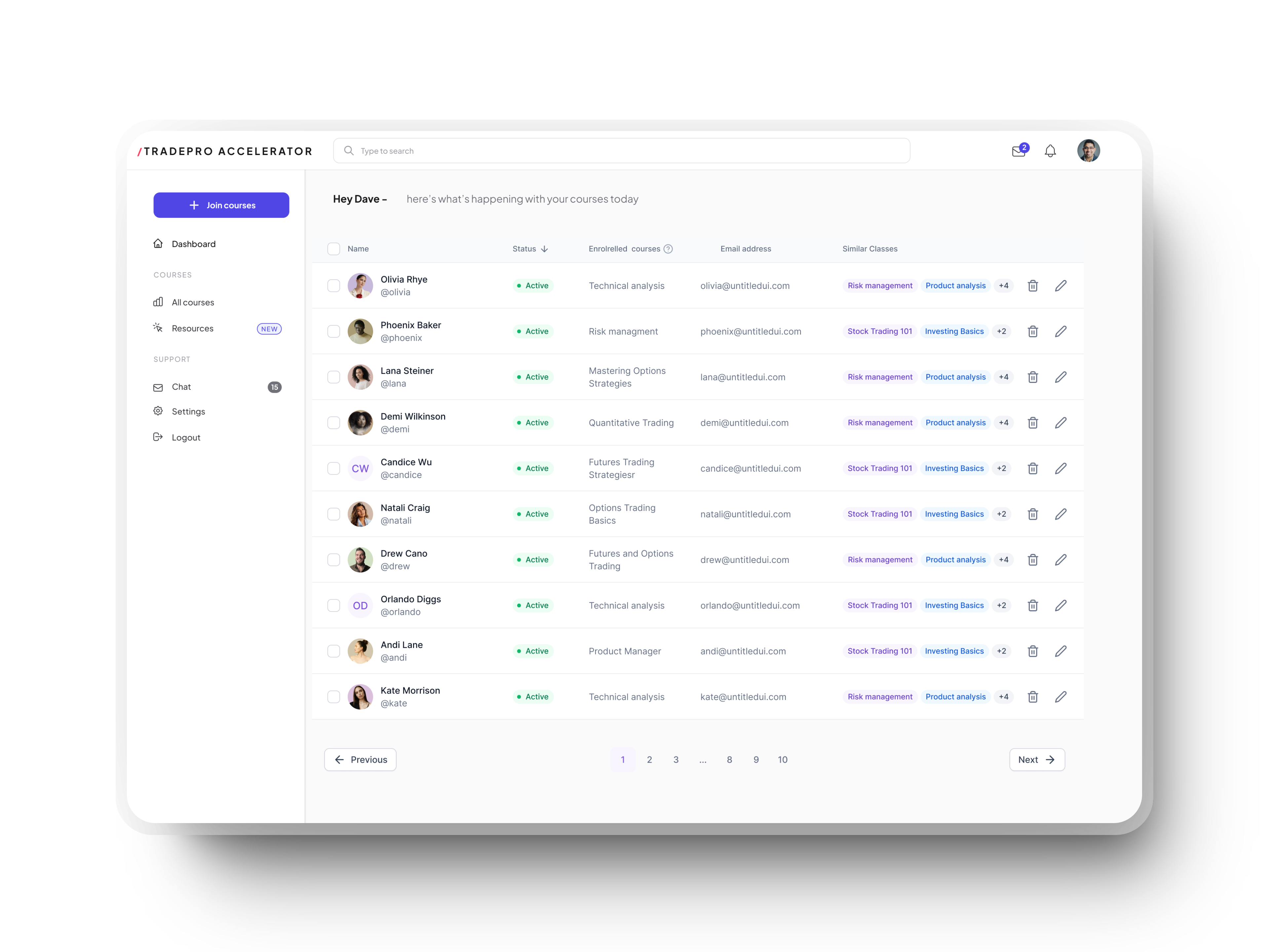
- Purpose: The dashboard is the central hub, offering users a clear overview of their activities and progress.
- Key Features: Clarity and ease of navigation were prioritized, with interactive graphs and widgets enhancing data visualization and engagement.
- Design Process: Usability testing revealed that users needed better ways to track progress and navigate the platform. This insight led to a streamlined Dashboard that centralizes essential tools and information. The design iterations, informed by user feedback, ensured a clean, intuitive interface that supports users in tracking their learning journey and staying motivated.

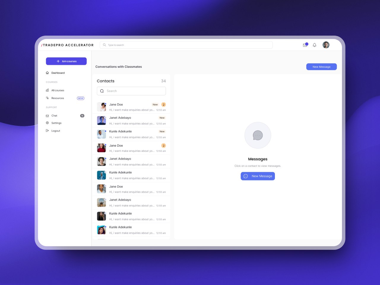
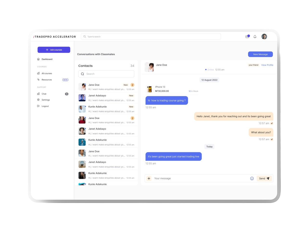
Community Engagement Forum
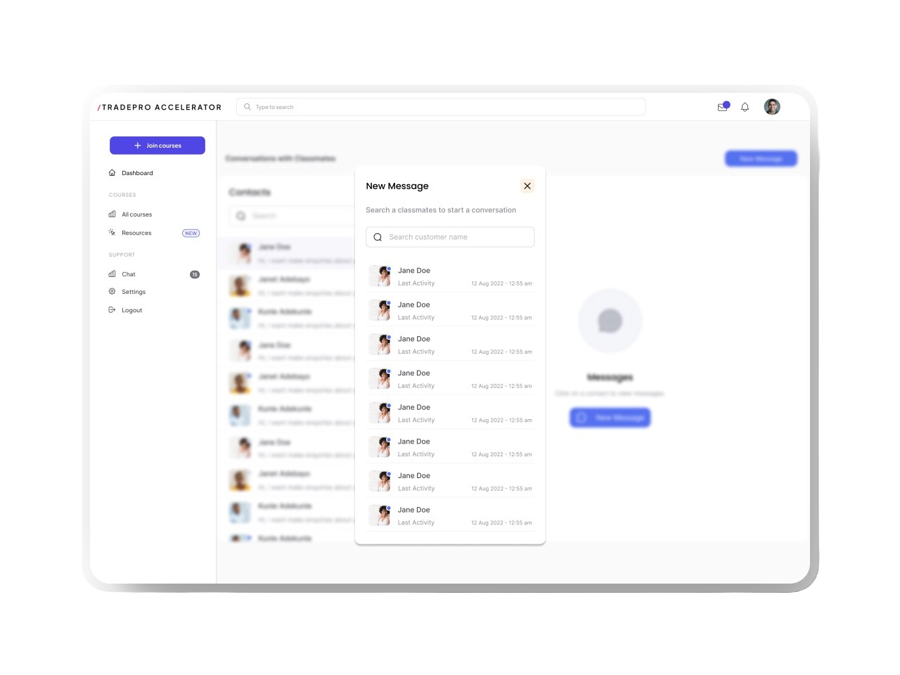
Purpose: The forum is designed to foster a sense of community among traders, providing a space where users can connect, share insights, and support each other throughout their learning journey.
Key Features:
- Real-Time Messaging & Activity Indicators: I integrated real-time messaging with active user counts and status indicators, allowing users to see who’s online and engage in live conversations. This feature makes the forum more dynamic and responsive.
- Search Functionality: To help users find topics, posts, or users quickly, I added a robust search bar, streamlining the process of connecting with relevant content and people.
Design Process & Decisions: Usability testing revealed that users struggled with navigating unclear categories and the lack of a search function. In response, I developed a more intuitive design featuring visually distinct categories and a search bar. Real-time activity indicators were added based on user feedback to help users easily identify ongoing conversations. These design iterations ensured the forum enhanced community interaction, aligning with user needs.
Resources Page
Purpose: The Resources Page centralizes users' saved educational materials, providing easy access to videos, courses, quizzes, discussions, and instructor information. It serves as a hub for users to continue their learning journey at their own pace.
Key features: Include the ability to track progress, review quiz results, and engage in course-related discussions. Users can explore content from instructors and receive personalized recommendations based on their progress. This page encourages continued learning by providing easy access to educational materials and fostering a collaborative environment.
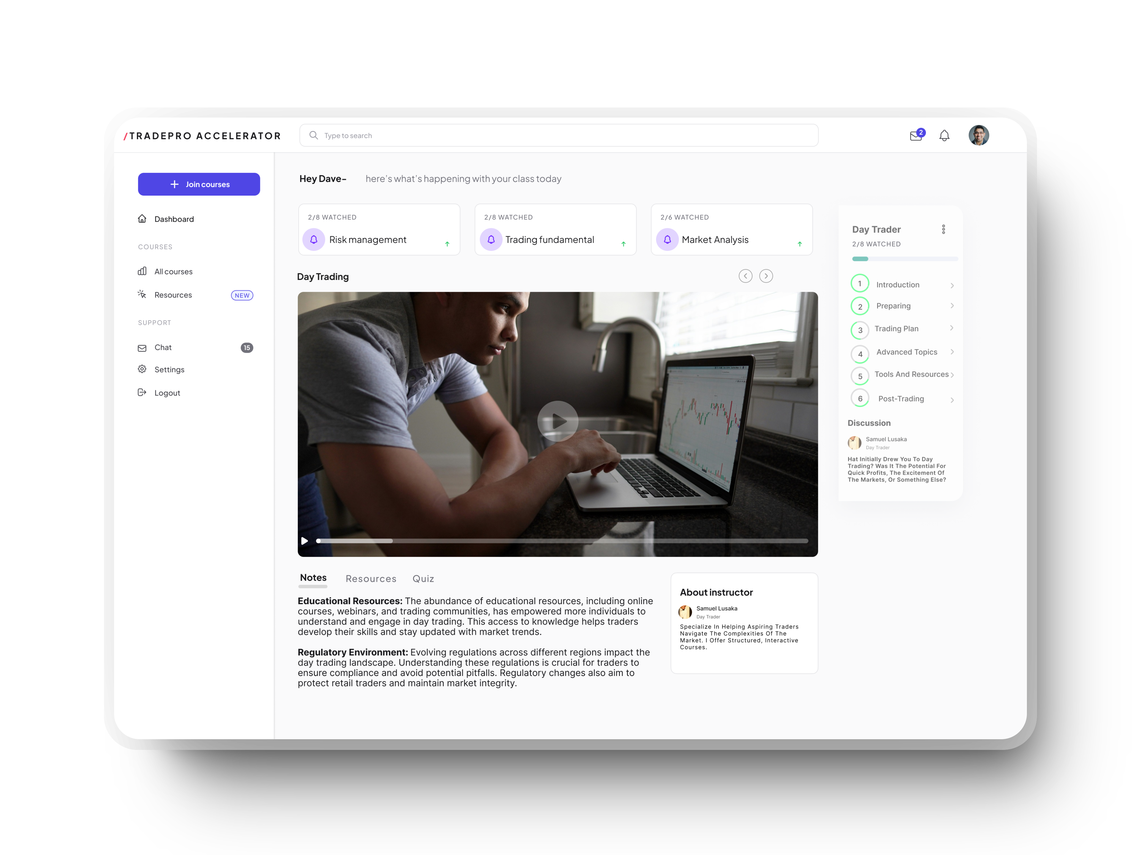
Design Process: Usability testing revealed users struggled tracking progress across materials. This led to developing the Resources Page, consolidating saved content in one accessible location. We iterated on the design to create a clean, intuitive interface for seamless navigation, enhancing users' educational journey.
Iterative Design
Listening to User Needs
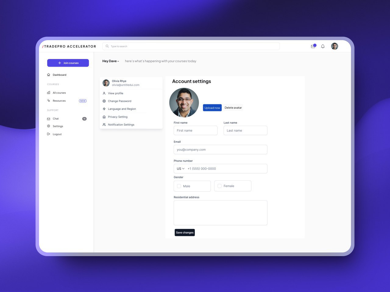
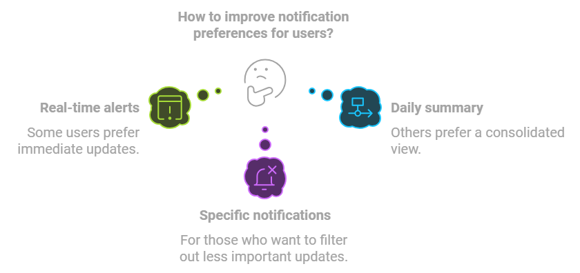
During our initial testing phases, users frequently expressed a desire for more control over how they receive notifications. This feedback highlighted a gap in our original design, where notification settings were either too limited or not customizable enough to meet the diverse needs of our users.
Notification Settings Improvement
- Users requested customizable notifications to match individual preferences.
- We implemented a feature allowing users to choose notification types, frequency, and importance levels.
Design Process and Decisions
- Feedback Integration: User tests highlighted the need for customizable notifications. We evolved from simple toggles to a granular system for managing specific alerts.
- Prototyping and Testing: Multiple prototypes were created and tested to find the most user-friendly approach.
- Final Design: A dedicated notification settings page within the user profile balances simplicity and control, improving overall user experience.
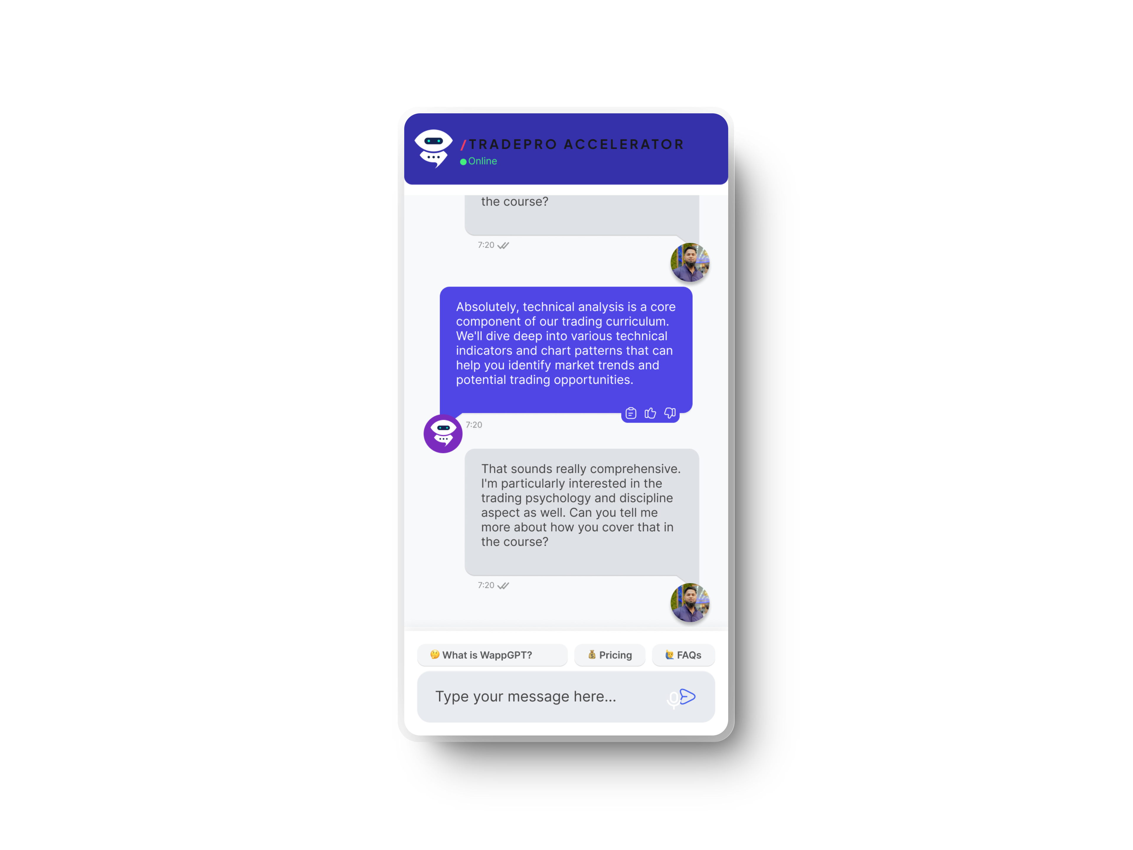
Iterative Design: Chatbot Feature
Why I Designed It:
- User Feedback: Users wanted quicker access to help, especially when live support was unavailable.
- Scalability: A chatbot efficiently handles common queries, reducing strain on support teams.
- Continuous Engagement: The chatbot acts as an interactive guide, helping users explore the platform.
Iterative Design: Language Customization
- Initial Phase: Based on user feedback, we recognized the need for a more inclusive platform, particularly for non-English speakers. Arabic was prioritized due to its relevance in key markets.
- First Iteration: We implemented Arabic with basic translation and right-to-left (RTL) support. Early feedback highlighted the importance of seamless navigation and clear content presentation in Arabic.
- Improvement Cycle: Through continuous testing and user input, we refined the RTL layout and improved translation quality, ensuring it met both functional and cultural standards.
Success Metrics
Following the launch of TradePro Accelerator, we closely monitored key performance indicators to evaluate the platform's impact on user engagement and learning outcomes.
Key Metrics:
Quantify Results
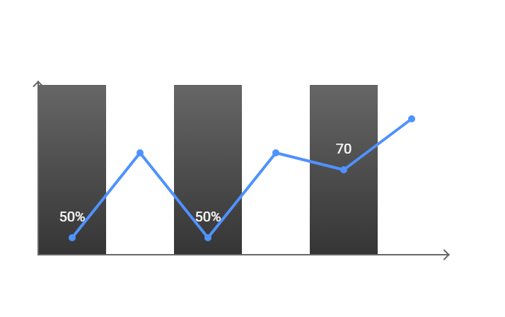
- User Engagement: Projected 50% increase in daily active users within 3 months, due to improved navigation and content layout.
- Completion Rates: Expected rise to 75% within 2 months post-launch, up from 50%, thanks to streamlined course structures.
- Satisfaction: Anticipated 85% user satisfaction score, up from 70%, indicating effective design improvements.
Link Design to Business Goal
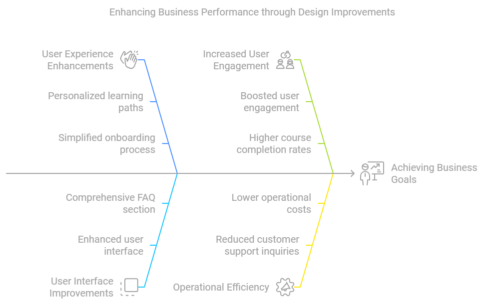
- Higher Retention Rates: Personalized learning paths and simplified onboarding expected to reduce churn rates from 25% to 15%, increasing customer lifetime value.
- Reduced Support Queries: Enhanced UI and FAQ section projected to decrease support inquiries by 30%, lowering operational costs.
- Increased Revenue: Improved engagement anticipated to boost course sales revenue by 20% within six months post-launch.
What I Learned
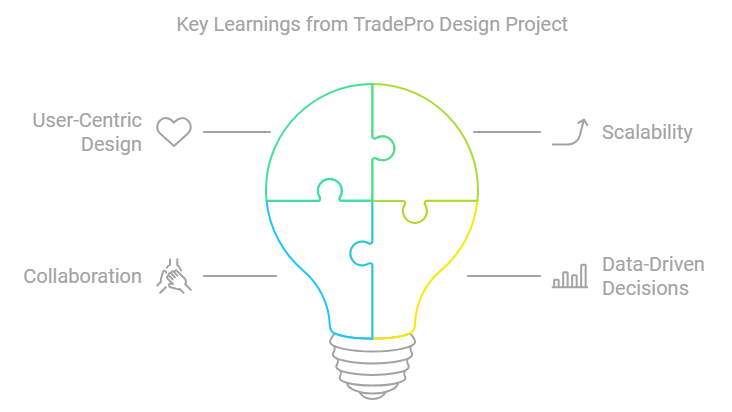
- User-Centric Design: Incorporating user feedback at each stage is crucial for meeting expectations.
- Scalability: Creating flexible designs that evolve with platform growth ensures consistent user experience.
- Collaboration: Cross-disciplinary teamwork and adaptability improve workflow and outcomes.
- Data-Driven Decisions: Metrics guide design choices, optimizing user journeys and business results beyond aesthetics.
